Добрый день! Наш аккаунт - SL-36430.
На мобильных сайт отображается плохо. Там миллион проблем.
Сегодня я попробовал и на телефоне поставил "галочку" в поле "полная версия" - и отображается намного лучше.
Подскажите, как сделать, чтобы по умолчанию на мобильных телефонах показывалась полная версия? Чем это может навредить? Не повредит ли это базовой версии сайта (для PC) и версии сайта для планшетов?
Спасибо!
 0
0

Отображение Мобильной Версии Сайта.
Автор Nicolas, 08 мая 2018 16:37
Сообщений в теме: 3
#2
Vaccina
-

- Модераторы
-

- 24 353 сообщений
Активный участник
Отправлено 09 Май 2018 - 08:50
Здравствуйте.
Зайдите в раздел Сайт - Редактор шаблонов - main.css - найдите и удалите:
далее зайдите в шаблон HTML - найдите:
замените на:
Зайдите в раздел Сайт - Редактор шаблонов - main.css - найдите и удалите:
/* Адаптивность шаблона ==============================*/
@media only screen and (min-width: 981px) and (max-width: 1220px) {
  .inner {width:95%;}
}
@media only screen and (min-width: 990px) {
  #header  .flexslider li img.slide_img{display:block !important;}
  #header  .flexslider li .bigPic {display:none !important;}
  #header.borderless {border-bottom:none;}
}
@media only screen and (min-width: 768px) and (max-width: 980px) {
  .inner {width:95%;}
  #header_colapse .inner {background:none !important;}
  #footer .column {width:22% !important;margin:10px !important;min-height:100px;}
  div.prod_hold .prod-info-fly .price, div.prod_hold_recent .prod-info-fly .price {margin-bottom:25px;}
  #column-left + #content div.prod_hold, #column-left + #content div.prod_hold_recent  {	margin:0px 11px 20px 11px;}
  #toggle_switch {display:block;}
  p img {max-width:100% !important;height:auto !important;}
  .product-info .cart {height:auto;overflow:auto;}
  .product-info .cart input[type="text"] {margin-bottom:10px;}
  .orderStepName {font-size: 18px;}
  .orderStepName:before {margin-right: 5px;}
  table.form tr td:first-child {width: 40%;*width: 0px;}
  #content .login-content .content {padding: 0;overflow: visible;}
  .login-content  table.form td {position: relative;width: 100%;display: block; padding: 4px 0;}
}
@media screen and (max-width: 785px) {
  .orderStepName {font-size: 16px;}
  table.form  {table-layout: fixed;}
  table.form tr td:first-child {width: auto;}
}
@media only screen and (max-width: 625px) {
  .orderHeader  {display: none !important;}
}
@media only screen and (min-width: 557px) and (max-width: 898px) {
  .item-detail{width: 49%;}
}
@media only screen and (min-width: 480px) and (max-width: 556px) {
  .item-detail {width: 40%;}
}
@media only screen and (min-width: 480px) and (max-width: 767px) {
  #toggle_switch {display:none;}
  .inner {width:86%;}
  #header_colapse .inner {display:block !important;}
  #header #cart {right: 0px;width: auto;float: none;}
  .box-product, .product-list, .product-list2, .product-list3, .product-list4 {text-align:center;}
  div.prod_hold, div.prod_hold_recent {margin:10px auto;}
  div.prod_hold .name, div.prod_hold .price, div.prod_hold_recent .name, div.prod_hold_recent .price {display: none;}
  div.prod_hold .prod-info-fly, div.prod_hold_recent .prod-info-fly{display: block;position: relative;padding: 0;bottom: 0;opacity: 1;width: 200px; }
  div.prod_hold .prod-info-fly .name, div.prod_hold .prod-info-fly .price, div.prod_hold_recent .prod-info-fly .name, div.prod_hold_recent .prod-info-fly .price { display: block !important;}
  #header .links {margin:0;}
  #compareInfo {margin: 10px auto -20px;width: 100%;text-align: center;}
  #header #welcome {	display: none;}
  #header #search {	position:relative;clear:both;width:440px;margin-bottom: 19px;float: left;}
  #header #search input {width:380px;}
  #header #support {display:none;}
  #header #cart h4, #header #cart #cart-total {display:block;}
  #header #cart .content {top:35px;}
  #header_colapse .inner {	overflow: visible;	padding:8px 0;	background:none !important;}
  #column-left {	float:none;	width:100%;}
  #column-left .recent {display: none!important;}
  #column-left + #content {margin: 0;	}
  #footer .column {width:100% !important;margin:10px 0 !important;min-height:100px;}
  #footer .one_fourth {display: none;}
  #footer .one_fourth.last {display: block;}
  #tabs a {font-size:14px;}
  .product-info .image {width:380px;}
  .product-info .image img{max-width:100%;	}
  .product-info >.left, .product-info > .left + .right {float:none;margin: 0;}
  img {max-width:100% !important;height:auto !important;}
  textarea {width: 100%;}
  #column-left div.prod_hold, #column-left div.prod_hold_recent {margin:0px 8px 20px 8px;}
  .product-filter .view-mode label {display: none;}
  #main_nav { display: none; }
  .selectnav { display: block; margin:6px 0 0 0; width:100%; }
  #column-left .box .box-heading:after {content: url("{ASSETS_IMAGES_PATH}downArrow.png?design=spring") no-repeat right center;position: absolute;right: 16px;top: 10px;cursor: pointer;}
  #column-left .box .box-heading + .box-content {display: none;}
  #column-left .box .box-heading.up:after {content: url("{ASSETS_IMAGES_PATH}UPArrow.png?design=spring") no-repeat right center;}
  table.form  {table-layout: fixed;}
  #content .login-content .content {padding: 0;overflow: visible;}
  .login-content h4, .login-content .right p {display: none;}
  p.required {display: none;}
  .login-content  table.form td {position: relative;width: 100%;display: block;padding: 4px 0;}
  .generally label:after {content: ""; display: block;clear: both;}
}
@media only screen and (max-width: 480px) {
  h2 {font-size: 24px;}
  .inner {width:80%;}
  #header_colapse .inner {display:block !important;}
  #toggle_switch {display:none;}
  #header .links {margin:0;}
  #compareInfo {margin-left:0px;float: left;}
  #header #welcome {display: none;}
  #header #search {position:relative;clear:both;width:100%;margin-bottom:10px;}
  #header #search input {width:70%;}
  #header #support {display:none;}
  #header #logo {margin: 0;}
  #header #cart{ width: 98%; min-width: 98%;float: none;margin-bottom: 10px;}
  #header #cart .heading {padding: 0 0 0 46px;}
  #header #cart .cart_circle {right: auto; left: 0;}
  #header #cart h4, #header #cart #cart-total {display:block;text-align: left !important;}
  #header #cart .content {top:35px;}
  #header_colapse .inner {overflow:visible;padding:8px 0;background:none !important;}
  #main_nav { display: none; }
  .selectnav { display: block; margin:6px 0 0 0; width:100%; }
  #column-left {float:none;width:100%;}
  #column-left .recent {display: none!important;}
  #column-left + #content {margin: 0;}
  .box-product, .product-list, .product-list2, .product-list3, .product-list4 {text-align:center;}
  div.prod_hold, div.prod_hold_recent {margin:10px auto;width: 90%;}
  div.prod_hold > div .prod-info-fly, div.prod_hold_recent > div .prod-info-fly {width: 100%;}
  div.prod_hold .name, div.prod_hold .price, div.prod_hold_recent .name, div.prod_hold_recent .price {display: none;}
  div.prod_hold .prod-info-fly, div.prod_hold_recent .prod-info-fly {display: block;position: relative;padding: 0;bottom: 0;opacity: 1; }
  div.prod_hold .prod-info-fly .name, div.prod_hold .prod-info-fly .price, div.prod_hold_recent .prod-info-fly .name, div.prod_hold_recent .prod-info-fly .price{display: block !important;}
  .item-detail {width: 100%;}
  #footer .column {width:100% !important;margin:10px 0 !important;min-height:100px;}
  #footer .one_fourth {display: none;}
  #footer .one_fourth.last {display: block;}
  #tabs a {font-size:12px;padding:10px;}
  .category-info {padding: 10px 0;}
  .category-info .left {float:none;}
  .category-info .right {margin: 10px 0 0 0; padding: 0;}
  .product-info .image {width:260px;}
  .product-info .image img{max-width:100%;	}
  .product-info >.left, .product-info > .left + .right {float:none;margin: 0;}
  .login-content .left, .login-content .right {width:95%;float:left;margin-bottom:10px;}
  img {max-width:100% !important;height:auto !important;}
  textarea {width: 100%;}
  #column-left .box .box-heading:after {content: url("{ASSETS_IMAGES_PATH}downArrow.png?design=spring") no-repeat right center;position: absolute;right: 16px;top: 10px;cursor: pointer;}
  #column-left .box .box-heading + .box-content {display: none;}
  #column-left .box .box-heading.up:after {content: url("{ASSETS_IMAGES_PATH}UPArrow.png?design=spring") no-repeat right center;}
  table.form td {position: relative;width: 100%;display: block;padding: 4px 0;}
  #content .login-content .content {padding: 10px 0;overflow: visible;}
  p.required {display: none;}
  #content .buttons .left {display: none;}


}

/* /END адаптивность шаблона ======================================================*/
далее зайдите в шаблон HTML - найдите:
<meta name="viewport" content="width=device-width, initial-scale=1.0" />
замените на:
<meta name="viewport" content="width=1200">
#3
Nicolas
-
- Пользователи
-

- 113 сообщений
Продвинутый пользователь
Отправлено 09 Май 2018 - 12:59
 Vaccina (09 Май 2018 - 08:50) писал:
Здравствуйте.
Зайдите в раздел Сайт - Редактор шаблонов - main.css - найдите и удалите:
далее зайдите в шаблон HTML - найдите:
замените на:
Зайдите в раздел Сайт - Редактор шаблонов - main.css - найдите и удалите:
/* Адаптивность шаблона ==============================*/
@media only screen and (min-width: 981px) and (max-width: 1220px) {
.inner {width:95%;}
}
@media only screen and (min-width: 990px) {
#header .flexslider li img.slide_img{display:block !important;}
#header .flexslider li .bigPic {display:none !important;}
#header.borderless {border-bottom:none;}
}
@media only screen and (min-width: 768px) and (max-width: 980px) {
.inner {width:95%;}
#header_colapse .inner {background:none !important;}
#footer .column {width:22% !important;margin:10px !important;min-height:100px;}
div.prod_hold .prod-info-fly .price, div.prod_hold_recent .prod-info-fly .price {margin-bottom:25px;}
#column-left + #content div.prod_hold, #column-left + #content div.prod_hold_recent { margin:0px 11px 20px 11px;}
#toggle_switch {display:block;}
p img {max-width:100% !important;height:auto !important;}
.product-info .cart {height:auto;overflow:auto;}
.product-info .cart input[type="text"] {margin-bottom:10px;}
.orderStepName {font-size: 18px;}
.orderStepName:before {margin-right: 5px;}
table.form tr td:first-child {width: 40%;*width: 0px;}
#content .login-content .content {padding: 0;overflow: visible;}
.login-content table.form td {position: relative;width: 100%;display: block; padding: 4px 0;}
}
@media screen and (max-width: 785px) {
.orderStepName {font-size: 16px;}
table.form {table-layout: fixed;}
table.form tr td:first-child {width: auto;}
}
@media only screen and (max-width: 625px) {
.orderHeader {display: none !important;}
}
@media only screen and (min-width: 557px) and (max-width: 898px) {
.item-detail{width: 49%;}
}
@media only screen and (min-width: 480px) and (max-width: 556px) {
.item-detail {width: 40%;}
}
@media only screen and (min-width: 480px) and (max-width: 767px) {
#toggle_switch {display:none;}
.inner {width:86%;}
#header_colapse .inner {display:block !important;}
#header #cart {right: 0px;width: auto;float: none;}
.box-product, .product-list, .product-list2, .product-list3, .product-list4 {text-align:center;}
div.prod_hold, div.prod_hold_recent {margin:10px auto;}
div.prod_hold .name, div.prod_hold .price, div.prod_hold_recent .name, div.prod_hold_recent .price {display: none;}
div.prod_hold .prod-info-fly, div.prod_hold_recent .prod-info-fly{display: block;position: relative;padding: 0;bottom: 0;opacity: 1;width: 200px; }
div.prod_hold .prod-info-fly .name, div.prod_hold .prod-info-fly .price, div.prod_hold_recent .prod-info-fly .name, div.prod_hold_recent .prod-info-fly .price { display: block !important;}
#header .links {margin:0;}
#compareInfo {margin: 10px auto -20px;width: 100%;text-align: center;}
#header #welcome { display: none;}
#header #search { position:relative;clear:both;width:440px;margin-bottom: 19px;float: left;}
#header #search input {width:380px;}
#header #support {display:none;}
#header #cart h4, #header #cart #cart-total {display:block;}
#header #cart .content {top:35px;}
#header_colapse .inner { overflow: visible; padding:8px 0; background:none !important;}
#column-left { float:none; width:100%;}
#column-left .recent {display: none!important;}
#column-left + #content {margin: 0; }
#footer .column {width:100% !important;margin:10px 0 !important;min-height:100px;}
#footer .one_fourth {display: none;}
#footer .one_fourth.last {display: block;}
#tabs a {font-size:14px;}
.product-info .image {width:380px;}
.product-info .image img{max-width:100%; }
.product-info >.left, .product-info > .left + .right {float:none;margin: 0;}
img {max-width:100% !important;height:auto !important;}
textarea {width: 100%;}
#column-left div.prod_hold, #column-left div.prod_hold_recent {margin:0px 8px 20px 8px;}
.product-filter .view-mode label {display: none;}
#main_nav { display: none; }
.selectnav { display: block; margin:6px 0 0 0; width:100%; }
#column-left .box .box-heading:after {content: url("{ASSETS_IMAGES_PATH}downArrow.png?design=spring") no-repeat right center;position: absolute;right: 16px;top: 10px;cursor: pointer;}
#column-left .box .box-heading + .box-content {display: none;}
#column-left .box .box-heading.up:after {content: url("{ASSETS_IMAGES_PATH}UPArrow.png?design=spring") no-repeat right center;}
table.form {table-layout: fixed;}
#content .login-content .content {padding: 0;overflow: visible;}
.login-content h4, .login-content .right p {display: none;}
p.required {display: none;}
.login-content table.form td {position: relative;width: 100%;display: block;padding: 4px 0;}
.generally label:after {content: ""; display: block;clear: both;}
}
@media only screen and (max-width: 480px) {
h2 {font-size: 24px;}
.inner {width:80%;}
#header_colapse .inner {display:block !important;}
#toggle_switch {display:none;}
#header .links {margin:0;}
#compareInfo {margin-left:0px;float: left;}
#header #welcome {display: none;}
#header #search {position:relative;clear:both;width:100%;margin-bottom:10px;}
#header #search input {width:70%;}
#header #support {display:none;}
#header #logo {margin: 0;}
#header #cart{ width: 98%; min-width: 98%;float: none;margin-bottom: 10px;}
#header #cart .heading {padding: 0 0 0 46px;}
#header #cart .cart_circle {right: auto; left: 0;}
#header #cart h4, #header #cart #cart-total {display:block;text-align: left !important;}
#header #cart .content {top:35px;}
#header_colapse .inner {overflow:visible;padding:8px 0;background:none !important;}
#main_nav { display: none; }
.selectnav { display: block; margin:6px 0 0 0; width:100%; }
#column-left {float:none;width:100%;}
#column-left .recent {display: none!important;}
#column-left + #content {margin: 0;}
.box-product, .product-list, .product-list2, .product-list3, .product-list4 {text-align:center;}
div.prod_hold, div.prod_hold_recent {margin:10px auto;width: 90%;}
div.prod_hold > div .prod-info-fly, div.prod_hold_recent > div .prod-info-fly {width: 100%;}
div.prod_hold .name, div.prod_hold .price, div.prod_hold_recent .name, div.prod_hold_recent .price {display: none;}
div.prod_hold .prod-info-fly, div.prod_hold_recent .prod-info-fly {display: block;position: relative;padding: 0;bottom: 0;opacity: 1; }
div.prod_hold .prod-info-fly .name, div.prod_hold .prod-info-fly .price, div.prod_hold_recent .prod-info-fly .name, div.prod_hold_recent .prod-info-fly .price{display: block !important;}
.item-detail {width: 100%;}
#footer .column {width:100% !important;margin:10px 0 !important;min-height:100px;}
#footer .one_fourth {display: none;}
#footer .one_fourth.last {display: block;}
#tabs a {font-size:12px;padding:10px;}
.category-info {padding: 10px 0;}
.category-info .left {float:none;}
.category-info .right {margin: 10px 0 0 0; padding: 0;}
.product-info .image {width:260px;}
.product-info .image img{max-width:100%; }
.product-info >.left, .product-info > .left + .right {float:none;margin: 0;}
.login-content .left, .login-content .right {width:95%;float:left;margin-bottom:10px;}
img {max-width:100% !important;height:auto !important;}
textarea {width: 100%;}
#column-left .box .box-heading:after {content: url("{ASSETS_IMAGES_PATH}downArrow.png?design=spring") no-repeat right center;position: absolute;right: 16px;top: 10px;cursor: pointer;}
#column-left .box .box-heading + .box-content {display: none;}
#column-left .box .box-heading.up:after {content: url("{ASSETS_IMAGES_PATH}UPArrow.png?design=spring") no-repeat right center;}
table.form td {position: relative;width: 100%;display: block;padding: 4px 0;}
#content .login-content .content {padding: 10px 0;overflow: visible;}
p.required {display: none;}
#content .buttons .left {display: none;}


}

/* /END адаптивность шаблона ======================================================*/
далее зайдите в шаблон HTML - найдите:
<meta name="viewport" content="width=device-width, initial-scale=1.0" />
замените на:
<meta name="viewport" content="width=1200">
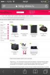
Спасибо! Получилось, но теперь при заходе с мобильного "обрезается" цвет шапки наверху (телефоны на красном фоне, а корзина на белом).
Подскажите, пожалуйста, как это исправить?
#4
metry
-

- Модераторы
-
- 884 сообщений
Активный участник
Отправлено 09 Май 2018 - 15:02
Добрый день. Пожалуйста, очистите кэш браузера на мобильном устройстве. Сейчас проблема с отображением сайта на мобильном устройстве не наблюдается.
Прикрепленные изображения


Количество пользователей, читающих эту тему: 0
0 пользователей, 0 гостей, 0 анонимных


