На счет отключения мобильной версии, в main.css найдите:
/* Позиция слева в адаптивном шаблоне для корзины и поиска */
@media screen and (max-width: 540px) {
.searchForm {
float:left;
}
.body-top-left {
padding-left: 1px;
}
.right_links {
margin-right: 5px;
}
}
замените на:
/* Позиция слева в адаптивном шаблоне для корзины и поиска
@media screen and (max-width: 540px) {
.searchForm {
float:left;
}
.body-top-left {
padding-left: 1px;
}
.right_links {
margin-right: 5px;
}
}
*/
далее найдите:
@media screen and (max-width: 1100px) {
.table_mini figure .goodsListContent {
width: 89%;
}
}
@media screen and (max-width: 1024px) {
.cort .left {
width:39%
}
.cort .right {
width: 60%
}
form#quickform {
width: 100%;
margin: 0;
}
.PageCartBlock {
}
.bigImages img {
height: auto;
}
}
@media screen and (max-width: 980px) {
.sectionblock-container {
width: 84%;
}
.table_mini figure .goodsListContent {
width: 87%;
}
.tovars-block {
padding: 001%;
}
.productPageContent .content-center {
margin: 0;
float: left;
padding: 0 1%;
}
.bigImages {
max-height: 400px;
height: auto;
}
#owl-one-slider-tovar .item {
margin-top: 0;
height: 100%;
}
.cart {
float: right;
width: 70%;
padding-right: 0.6em;
display: inline-block;
text-align: left;
}
.searchForm {
float: left;
display: inline-block !important;
margin-bottom: 15px;
}
nav.head, nav.footer-menu {
position: relative;
width: 100%;
text-align: center;
}
ul.head li {
float: none !important;
}
nav.head,nav.footer-menu {
position: relative;
width: 100%
}
nav.sectionblock-container ul.nav {
padding-left: 0;
}
.conta ul.nav > li:first-child a {
padding-left: 12px;
}
.recentlyImg {
width: 98.5%;
max-height: 200px;
padding: 2%;
}
.recentlyContent {
display: inline-block;
float: left;
width: 100%;
min-height: 83px
}
.noToCart {
height: 37px;
}
.recentlyProductsList .item {
height: auto;
text-align: center
}
.cort .right>ul span {
display: none
}
.goods_order_fields select {
width: auto;
}
.hideBtn {
opacity: 1
}
input#goods-filter-min-price,input#goods-filter-max-price {
width: 100%!important
}
.goodsFilterPriceInfo .tire {
display: none
}
.ui-slider-horizontal .ui-slider-handle {
margin-left: -0.7em;
}
.filter {
padding: 3% 0
}
.goodsFilterPriceInfo span {
width: 100%
}
.footerblock-container {
padding-right: 1%;
padding-left: 1%
}
.recentlyImg img {
max-height: 190px;
}
.listCart:before {
margin-left: 12px;
}
.listCart:after {
margin-left: 13px;
}
div#goods-filter-price-slider {
width: 86%;
}
.modif ul li {
margin-left: 0;
width: 100%;
}
}
@media screen and (max-width: 960px) {
a.btn.table {background-position: -25px -29px;}
a.btn.list {background-position: 1px -29px;}
a.btn.table_mini {background-position: -25px -29px;}
a.btn.table.current, a.btn.table:hover {background-position: -25px -2px;}
a.btn.list.current,a.btn.list:hover {background-position: 1px -2px;}
a.btn.table_mini.current, a.btn.table_mini:hover {background-position: -25px -2px;}
}
@media screen and (max-width: 960px) {
.button-up {display: none !important;}
}
@media screen and (max-width: 880px) {
.cartBtn .countTovars{
/* margin-top:10px;*/
}
.bottom-inner-content > div.infoBox {
display: inline-block !important;
float: right !important;
padding-right: 13px !important;
text-align: right !important;
width: auto;
top: -85px;
}
.body-vertical-center {
float: left;
}
.body-column-left {
float: none;
float: left;
width: 100%;
margin-bottom: 0;
padding: 0
}
.body-vertical-center .body-column-right {
width: 100%;
padding-left: 0
}
.filter {
float: left;
width: 33.33%;
padding: 0 1%
}
.goodsFilterPriceInfo span {
float: left;
width: 50%;
text-align: center
}
input#goods-filter-min-price,input#goods-filter-max-price {
width: 100%!important
}
.goodsFilterPriceInfo span:first-child {
width: 45%
}
.goodsFilterPriceInfo span:last-child {
width: 45%;
padding-right: 1%;
text-align: left
}
.goodsFilterPriceSubmit {
display: inline-block;
margin-top: .7em
}
.recently_viewed {
display: inline-block;
width: 100%;
margin: 1% 0%;
border: 1px solid rgba(0,0,0,.17);
-webkit-border-radius: 2px;
-moz-border-radius: 2px;
border-radius: 2px;
/* -webkit-box-shadow: 0 1px 0 rgba(0,0,0,.05); */
-moz-box-shadow: 0 1px 0 rgba(0,0,0,.05);
/* box-shadow: 0 1px 0 rgba(0,0,0,.05); */
position: relative;
}
.recentlyProductsList .item {
width: 46.8%;
margin: 1.6%;
min-height: 255px;
}
.recentlyImgUrl img {
max-height: 150px
}
.recentlyName {
overflow: hidden;
height: 1.8em;
padding: 0 1%
}
.recently_viewed .title_block {
display: inline-block;
float: left;
width: 100%;
padding: 1% 0.8%;
cursor: pointer;
color: #636363;
-webkit-border-radius: 2px;
-moz-border-radius: 2px;
border-radius: 2px;
background-color: #f4f4f4;
background: url('{ASSETS_IMAGES_PATH}downArrow.png?design=snow') no-repeat 98%;
/* -webkit-box-shadow: 0 1px 0 rgba(0,0,0,.05); */
/* -moz-box-shadow: 0 1px 0 rgba(0,0,0,.05); */
/* box-shadow: 0 1px 0 rgba(0,0,0,.05); */
border-bottom: 1px solid rgba(0,0,0,.17);
}
.recentlyContent .last {
display: inline-block;
width: 100%;
float: left;
height: 21px;
}
.recently_viewed .title_block:hover {
color: black
}
.recently_viewed.hide .block_content {
display: none;
}
.recently_viewed.hide h4.title_block {
border-bottom: 0;
/* background-image: url('{ASSETS_IMAGES_PATH}rightArrow-gray.png?design=snow'); */
}
.nojs .recently_viewed.hide .block_content {
display: block;
}
.nojs .recently_viewed.hide h4.title_block {
background: url('{ASSETS_IMAGES_PATH}downArrow.png?design=snow') no-repeat 98%;
}
.prices li:first-child {
padding-right: 0
}
.goodsFilterPriceInfo {
padding-top: 2em;
padding-left: 0
}
footer .column {
width: 48%;
margin: 1%
}
.sectionblock-inner-content {
min-height: initial;
min-height: inherit;
padding: 0 4px;
}
.bottom-inner-content > div {
width: 50%;
padding: 0;
float: none;
margin: 0 auto;
display: block;
text-align: center;
position: relative !important;
}
.logoblock-center, .logoblock-right, {
display: none !important;
}
.logoblock-left {
margin-top: 10px !important;
}
#image-1 {
position: relative;
right: initial;
bottom: initial;
height: 20px;
max-width: 300px;
width: 100%;
bottom: 0 !important;
right: initial !important;
}
/* .logoblock-left {
display: none
} */
input[type='search'] {
width: 85%
}
.body-top-left.body-content-top header {
width: auto;
}
.logoblock-center {
text-align: left
}
.logoblock-center>div {
float: left
}
div.logoblock-right {
display: none;
}
.infoBox {
margin: 1% 0;
padding: 1% 0
}
.sectionblock-container {
width: 78%;
}
ul.head {
float: none !important;
margin: 0 auto;
clear: both;
width: 100%;
}
.cart {
width: 40%;
text-align: left;
min-width: 10px;
float: right;
}
.cartBtn {
z-index: 9999;
height: 32px;
min-width: 100%;
vertical-align: middle;
text-align: center;
}
.searchForm {
float: left !important;
width: 60%;
text-align: center;
}
.cartBtn > .cartImg, .cartBtn > a {
display: inline-block;
float: none;
width: auto;
min-width: 16px;
}
.cartNameBtn1 {
padding-top: 2px;
padding-left: 2px;
display: none;
}
em.countNameTovars {
/* font-family: "Roboto-Bold", Arial, Helvetica CY, Nimbus Sans L, sans-serif, Helvetica; */
display: inline;
}
/* .countNameTovars {
font-family: "Roboto-Bold", Arial, Helvetica CY, Nimbus Sans L, sans-serif, Helvetica;
} */
.goodsFilterPriceInfo .tire {
display: inline-block
}
.prices .last {
font-size: 13px
}
.OrderFilterForm {
padding-bottom: 6px;
border: 0;
border-top: 1px solid #ebebeb;
box-shadow: 0 2px 3px rgba(0,0,0,.1);
width: 100%;
}
.body-column-left {
padding: 0 1%;
}
.thisIsGoodsPage {
padding-left: 0%;
padding-right: 0%;
}
.tovars-desc,.promotionalCampaignInfo {
padding-left: 7px;
padding-right: 7px;
}
.OrderFilterForm .cort {
padding: 0 .6em
}
.listCart.show {
margin-top:42px;
}
}
@media only screen and (max-width: 870px) {
.header-inner,.footer-inner-header {
position:relative;
height: auto
}
.listCart.show {
z-index: 400;
}
.cartBtn {
margin-bottom:-14px;
}
}
@media screen and (max-width: 768px) {
a.countTovars {
padding-right: 2px;
padding-left: 0;
}
.logoblock-center, .logoblock-right, {
display: none !important;
}
.cart {
min-width: 92px;
padding: 0;
float: right;
width: 40%;
}
.cartBtn > * {
float: none;
vertical-align: middle;
margin: 0;
}
.searchForm {
float: left;
display: inline-block;
margin-bottom: 5px;
text-align: right;
width: 60%;
}
.cartBtn {
width: 100%;
}
}
@media screen and (max-width: 750px) {
.oneNewsPage, .PageContentText .htmlDataBlock {
padding-left: 0;
}
dd.tab.active .htmlDataBlock {
padding: 0;
overflow-x: auto;
}
.cartListTable {
overflow-x: visible
}
}
@media screen and (max-width: 680px) {
.cort .left {
width:100%;
padding-bottom: 1%
}
.cort .right {
width: 100%
}
.cort .right ul li.per_page {
float: right
}
.cort .right ul .goods_order_fields {
float: left
}
.cort .left>ul {
width: 10%
}
.cort .right ul .goods_order_fields select {
width: 100%
}
.goods-table figure {
width: 50%
}
.productImgBlock,.productContentBlock {
width: 100%
}
.productContentBlock {
padding-top: 1.5%;
padding-left: 0;
}
.modif ul {
margin-bottom: 1%
}
.logoblock-center>div {
width: auto;
min-width: 100px;
padding: .8% 3%;
padding-left: 0.6em;
}
.bottom-inner-content .logoblock-center {
width: 30%
}
.bottom-inner-content .logoblock-right {
width: 70%
}
#owl-one-slider-tovar .item {
height: 100%;
margin-top: 0%;
}
.bigImages {
height: 320px
}
.goodsDataFeatures ul li {
width: 48%
}
.goodsDataFeatures ul li:last-child {
float: right
}
.tabsHeaders dt {
border-bottom: 0;
height: 35px;
line-height: 32px;
margin: 0.4em 0;
float: left;
padding-right: 1em;
}
.tabsHeaders h3 {
margin: 0;
padding: 0;
font-size: 1em;
padding: 0 0.4em;
white-space: nowrap;
/* border-radius: 2px; */
-webkit-user-select: none;
-moz-user-select: none;
-ms-user-select: none;
transition: all .2s;
border: 1px solid rgba(0,0,0,.17) !important;
-webkit-border-radius: 2px;
-moz-border-radius: 2px;
border-radius: 2px;
-webkit-box-shadow: 0 1px 0 rgba(0,0,0,.05);
-moz-box-shadow: 0 1px 0 rgba(0,0,0,.05);
box-shadow: 0 1px 0 rgba(0,0,0,.05);
}
.crumbs a,.breadcrumb a,.breadcrumb strong {
display: inline-block;
padding: 0 8px;
-webkit-user-select: none;
-moz-user-select: none;
-ms-user-select: none;
-webkit-transition: all .2s;
-moz-transition: all .2s;
-o-transition: all .2s;
transition: all .2s;
border: 1px solid rgba(0,0,0,.17);
-webkit-border-radius: 2px;
-moz-border-radius: 2px;
border-radius: 2px;
-webkit-box-shadow: 0 1px 2px rgba(0,0,0,.05);
-moz-box-shadow: 0 1px 2px rgba(0,0,0,.05);
box-shadow: 0 1px 2px rgba(0,0,0,.05);
margin: 4px 0;
}
.breadcrumb a,.breadcrumb strong {
padding: 4px 6px
}
.crumbs {
padding: 0 0%;
}
.crumbs a:hover,.breadcrumb a:hover {
-webkit-box-shadow: 0 0 0 rgba(0,0,0,.15);
-moz-box-shadow: 0 0 0 rgba(0,0,0,.15);
box-shadow: 0 0 0 rgba(0,0,0,.15)
}
.tabsHeaders {
margin: 0;
}
.tabsHeaders h3:hover, .tabsHeaders .active h3 {
border: 1px solid rgba(0,0,0,.17) !important;
background: #f8f8f8;
-webkit-box-shadow: inset 0 1px 1px rgba(0,0,0,.05);
-moz-box-shadow: inset 0 1px 1px rgba(0,0,0,.05);
box-shadow: inset 0 1px 1px rgba(0,0,0,.05);
}
.tabsHeaders dt.active .arrow, .tabsHeaders a:hover .arrow {
display: none;
}
.categoriesList .tabproduct {
max-width: 100%;
width: 50%;
min-height: 177px;
}
.productNameHeader {
margin-top: .6em;
}
.goodsTableButton>form {
padding: 0px 4.5%;
}
.positionOrder tfoot th:last-child {
width: 100px;
}
.cartTovar a,.cartDiscountTr a {
font-size: 0.8em;
}
ul.head li a, nav.footer-menu li a {
left: 8px;
}
.pageOformFullZakaz .body-top-right {
display: none;
}
.pageOformFullZakaz .body-content-top-center {
padding-top: 10px;
padding-bottom: 10px;
float: left;
}
}
@media screen and (max-width: 580px) {
.header-inner {
margin-bottom: 5px;
}
.bottom-inner-content .logoblock-center, .bottom-inner-content .logoblock-right {
display: none;
}
.bottom-inner-content .logoblock-left {
height: auto;
padding: 0;
}
#image-1 {
position: relative;
right: 0 !important;
bottom: 0 !important;
height: 20px !important;
width: 100%;
max-width: 300px;
overflow: hidden;
}
.searchForm {
width: 80%;
max-width: 80% !important;
margin-top: 5px;
}
input[type="search"] {
width: 80%;
}
.cart {
width: 10%;
overflow: hidden;
}
.cartBtn > * {
float: none;
margin: 0 auto;
width: 30px;
background-repeat: no-repeat;
background-position: center center;
vertical-align: middle;
}
.cart {
width: 100%;
float: left;
padding-top: 11px;
}
.sectionblock-container {
float: left;
width: 100%;
}
.cart {
float: right;
position: relative;
width: 20%;
overflow: visible;
min-width: 20px;
padding: 5px 1px 0 1px;
text-align: left;
line-height: 27px;
}
.listCart.show {
width: 320px;
right: 0;
left: initial;
}
.cartBtn {
margin: 0;
width: auto;
text-align: center;
}
.cartNameBtn1 {
display: none;
padding-top: 3px;
float: left;
}
a.countTovars {
display: none;
}
}
@media screen and (max-width: 540px) {
.cart {
line-height: 25px;
}
.bottom-inner-content > div.infoBox {
width: 50% !important;
padding: 0;
float: none !important;
margin: 0 auto;
display: block !important;
position: relative !important;
top: 0;
text-align: center !important;
}
.table_mini figure .goodsListPriceBlock {
width: 50%;
}
.table_mini figure .goodsToCartBlock > a {
display: none;
margin-top: -6px;
min-width: 100%;
width: 100%;
}
.bottom-inner-content .logoblock-right {
width:100%;
padding: 0 0 2% 0
}
.searchForm {
width: 100%;
max-width: 300px;
margin: 0 auto
}
input[type='search'] {
right: 0;
width: 100%;
padding: 10px 5px 10px 8px
}
.searchBtn.btn {
position: absolute;
top: 5px;
left: 89%;
float: right;
height: 31px
}
.infoBox {
float: left;
padding-left: 5px !important;
text-align: left;
width: 78% !important;
}
.bottom-inner-content .logoblock-center {
width: 100%
}
.logoblock-left {
display: inline-block;
width: 100%!important
}
.bottom-inner-content .logoblock-center>div {
float: none;
margin: 0 auto
}
.filter {
width: 50%
}
.goodsFilterPriceInfo {
padding-top: 0;
}
div#goods-filter-price-slider {
display: none;
}
.goodsTableButton>form {
height: 34px;
}
.goodsTableButton .btn {
font-size: 1em;
text-align: center;
font-weight: bold;
}
.goodsTableButton form>div,.goodsTableButton form {
}
.goodsTableButton .btnToCart {
display: inline-block;
width: 98px;
}
.goodsTableButton .numeric {
width: auto;
}
nav.sectionblock-container ul.nav {
display: none;
overflow: hidden;
}
.nojs nav.sectionblock-container ul.nav {
display: block;
}
.formList, .settingsUser ul.formList, .settingsUser form.clientForm,.loginForm .formList {
width: 100%
}
.registrFormBlock .formList {
width: 100%;
}
.pagePasswordRecovery ul.formList {
width: 100%;
}
.feedbackForm .formList {
width: 100%
}
.feedbackForm .formList label {
display: inline-block;
width: 100%;
padding-bottom: 5px
}
.formList li>*:last-child {
float: right;
}
.pageFeedback .formList li>*:last-child {
width: 100%;
}
.pageFeedback .formList .textareaBlock>*:last-child {
width: 100%
}
.feedbackForm .formList li>*:first-child {
float: left;
padding-right: 12px
}
.formList li {
padding: 0 0 .3em 0
}
.feedbackForm .formList li>button[type='submit'] {
width: 40%;
min-width: 180px
}
.headNamePage>div {
padding: 0 2%;
text-align: left
}
.zoom {
opacity: 1;
}
.zoom:hover {
opacity: 1;
}
.cort .left ul li {
border: 1px solid rgba(0,0,0,.17);
-webkit-border-radius: 2px;
-moz-border-radius: 2px;
border-radius: 2px;
-webkit-box-shadow: 0 1px 0 rgba(0,0,0,.05);
-moz-box-shadow: 0 1px 0 rgba(0,0,0,.05);
}
.cort .left > ul {
margin-right: 10px;
min-width: 78px;
width: auto;
}
.cort .left ul li:first-child {
margin-left: 0;
}
footer .column {
width: 98%
}
.newCont {
display: none;
}
.slow {
display: block;
}
.contactsSite li,.contactsSite li a {
font-size: 16px
}
.contactsSite .work-time {
text-align: center
}
.column span.toggleImg {
display: inline-block;
float: right;
width: 36px;
height: 36px;
text-align: right;
opacity: 1;
-moz-border-radius: 50%;
border-radius: 50%;
background: url('{ASSETS_IMAGES_PATH}rightArrow-gray.png?design=snow') no-repeat center;
background-color: white;
-webkit-box-shadow: 0 1px 2px 0 rgba(0,0,0,.258824);
-moz-box-shadow: 0 1px 2px 0 rgba(0,0,0,.258824);
box-shadow: 0 1px 2px 0 rgba(0,0,0,.258824);
-wibkit-border-radius: 50%;
margin-right: 5.1%;
position: absolute;
right: 0;
top: 9%;
z-index: 10;
}
.column span.toggleImg.show {
background: url('{ASSETS_IMAGES_PATH}downArrow.png?design=snow') no-repeat center
}
.goods-pagination {
margin-bottom: 1%;
padding: 2% 7px;
text-align: left;
border: 0
;
display: inline-block;
float: left;
}
.tabsHeadersCenter {
float: left;
padding: 0% 1%;
}
.tabsTovarInfo {
float: none
}
.goodsDataFeatures ul li {
width: 100%;
background-color: rgba(153,153,153,.11);
border-bottom: 4px solid white;
padding: 0 5px;
color: black;
}
.goodsDataFeatures ul li:first-child {
margin-bottom: -8px;
}
.headersTabsGoodPage {
background: #f8f8f8;
text-align: center;
font-size: 17px;
font-weight: bold;
}
.listCart {
width: 98%;
left: 0;
margin: 0 auto;
right: 0;
top: 49px;
z-index: 9999;
}
#oformZakazAjaxBlock .fieldset .input-text:not(#quickDeliveryConvenientDate), #oformZakazAjaxBlock .fieldset textarea {
width: 100%;
max-width: 100%;
}
.goodsDataOpinionAddForm textarea, .generally .inputDecorationBlock {
min-width: 100%;
}
.listCart.show {
top: 100%;
margin-top: 0%;
}
.formList li label {
width: 100%;
}
.formList li:not(.oneElement)>*:last-child, .formList li>*:last-child input {
width: 100%;
max-width: 100%;
}
.loginForm .formList .btn-group .btn.text {
margin: 0;
}
.buttons-set button.btn.submit {
width: auto;
float: left;
}
li.btn-group>span:last-child {
width: auto;
}
.promotionListContent {
width: 100%;
}
.goodsDataForm {
padding: 1% 2%;
}
.customNavigation {
opacity: 1;
}
.head a.pull {
padding-left: 2.8%;
}
.owl-prev, .owl-next {
opacity: 1;
}
.customNavigation.btn-next:hover, .owl-next:hover, .CompareGoodsTableNext a:hover, .customNavigation.btn-next, .owl-next, .CompareGoodsTableNext a,.customNavigation.btn-prew:hover, .owl-prev:hover, .CompareGoodsTablePrev a:hover,.customNavigation.btn-prew, .owl-prev, .CompareGoodsTablePrev a {
transition-duration: 0;
}
.loginForm li.btn-group>span:last-child {
width: auto;
}
.loginForm {
display: inline-block;
float: left;
width: 100%;
padding: 0 0.2em;
}
.recentlyProductsList .item {
min-height: 200px;
border: 0px solid rgba(0,0,0,.17);
}
.recentlyImg img {
max-height: 100px;
}
.categoriesList .tabproduct {
padding: 2%;
}
.categoriesList .item-box {
border: 0px #f0f0f0;
}
.icqImg {
padding-top: 2px;
}
.goodsTableButton .numeric .quantity {
text-align: center;
margin-right: 0.8em;
}
.footerblock-container .column h4 a {
width: 70%;
}
/*
input[type=number]::-webkit-inner-spin-button,
input[type=number]::-webkit-outer-spin-button {
-webkit-appearance: none;
margin: 0;
}
*/
}
@media screen and (max-width: 420px) {
.cart {
line-height: 25px;
}
.loginButtonGroups > div .btn {
margin-bottom: 7px;
}
.loginButtonGroups {
padding-bottom: 0px;
}
.caruseleControlGroup {
width: 74px;
height: 47px;
margin: 0;
}
.listProductsForIndexPages .caruseleControlGroup {
padding-top: 4px;
}
.controlLeft {
margin: 0;
white-space: nowrap;
position: absolute;
/* padding-left: 1.2%; */
}
.goods-table figure {
width: 100%;
padding: 0;
height: auto;
margin-bottom: 1em;
}
.goodsTableButton>form {
float: right;
width: 100%;
padding-right: 4.1%;
}
.goodsTableButton .numeric {
width: auto;
float: right;
}
.goodsTableButton .btnToCart {
width: auto;
float: right;
}
.goodsTableButton .btn {
text-align: left;
background-color: initial
}
.OrderFilterForm {
}
ul.head li,nav.footer-menu ul li {
width: 100%;
margin: 0;
}
.paginationBlock a,.paginationBlock .current,.paginationBlock span {
font-size: 18px
}
.goodsTableImg {
border: 0;
background-color: initial;
box-shadow: none;
border-radius: 2;
}
.goodsTableTovar {
border: 1px solid #c0c0c0;
-webkit-border-radius: 4px;
-moz-border-radius: 4px;
border-radius: 4px;
background-color: #FFF;
}
.goodsTableBottomBlock {
border-top: 0px solid #d9d9d9;
padding-bottom: 10px;
}
.goodsTablePrices .minPrice {
font-size: 18px;
font-weight: bold;
}
.caruseleTovars figure {
padding: 0 0.5%;
overflow: hidden;
}
.form-line input[type="text"] {
width: 100%;
}
.buttonsAddToCart, .othersButtons {
width: 100%;
}
.positionOrder th:last-child {
width: 100px;
}
#owl-one-slider .owl-prev, #owl-one-slider .owl-next {
top: 20%;
}
.caruseleTovars {
padding: 0 1%;
}
.caruseleControl {
padding: 0px 1%;
}
.prods-paginateBlock .btn-prev,.prods-paginateBlock .btn-next {
float: none;
margin: 0 auto;
border: 1px solid rgba(0,0,0,.17);
-webkit-border-radius: 2px;
-moz-border-radius: 2px;
border-radius: 2px;
/* -webkit-box-shadow: 0 1px 0 rgba(0,0,0,.05); */
/* -moz-box-shadow: 0 1px 0 rgba(0,0,0,.05); */
/* box-shadow: 0 1px 0 rgba(0,0,0,.05); */
}
.prods-paginateBlock .btn-next {
padding-left: 14px;
}
.page-next, .page-prev {
border: 1;
box-shadow: none;
}
.prods-paginateBlock .btn-prev {
margin-bottom: 10px;
padding-right: 10px;
}
.prods-paginate {
margin-bottom: 14px;
}
.goods_order_fields select {
width: 220px !important;
}
.recently_viewed .title_block {
padding-left: 11px;
}
.cort .right>ul span {
display: inline-block;
text-align: left;
width: 100%;
}
.cort .right ul li.per_page select {
float: left;
}
.cort .right ul li.per_page {
width: 100%;
float: left;
padding: 0;
}
.caruseleControlGroup .customNavigation.btn-next {
float: right;
}
.listCart:after, .listCart:before {
margin-top: -9px;
}
}
@media screen and (max-width: 370px) {
a.countTovars {
display: none !important;
}
#image-1 {
right: 0px !important;
bottom: 0px !important;
width: 92%;
}
.searchBtn.btn {
left: 85%;
}
.searchForm {
width: 75%;
}
.cart {
width: 25%;
padding: 0;
height: 37px;
line-height: 35px;
}
.header-inner {
margin-bottom: 13px;
}
.filter {
width:100%;
margin-bottom: 2%
}
.cort .right ul li {
width: 100%;
padding: 5px 0;
}
.cort .right ul li.per_page {
padding: 0;
}
.cort .right ul .goods_order_fields {
padding-bottom: 5px;
}
.btn-prev, .btn-next {
width: 100%;
display: inline-block;
text-align: center;
}
.prods-paginateBlock .btn-next {
padding-right: 15px;
padding-left: 0px;
}
}
@media screen and (max-width: 320px) {
a.countTovars {
display: none !important;
}
#image-1 {
right: 0px !important;
bottom: 0px !important;
width: 92%;
}
.searchBtn.btn {
left: 85%;
}
.searchForm {
width: 75%;
}
.cart {
width: 25%;
padding: 0;
height: 37px;
line-height: 35px;
}
.bottom-inner-content > div.infoBox {
width: 100%;
}
#compareInfoBlock {
display: block !important;
}
.header-inner {
margin-bottom: 13px;
}
.listCart.show {
margin-top:0px;
}
.table_mini figure .goodsListContent {
width: 69%;
}
}
замените на:
/* Отключение адаптивности
@media screen and (max-width: 1100px) {
.table_mini figure .goodsListContent {
width: 89%;
}
}
@media screen and (max-width: 1024px) {
.cort .left {
width:39%
}
.cort .right {
width: 60%
}
form#quickform {
width: 100%;
margin: 0;
}
.PageCartBlock {
}
.bigImages img {
height: auto;
}
}
@media screen and (max-width: 980px) {
.sectionblock-container {
width: 84%;
}
.table_mini figure .goodsListContent {
width: 87%;
}
.tovars-block {
padding: 001%;
}
.productPageContent .content-center {
margin: 0;
float: left;
padding: 0 1%;
}
.bigImages {
max-height: 400px;
height: auto;
}
#owl-one-slider-tovar .item {
margin-top: 0;
height: 100%;
}
.cart {
float: right;
width: 70%;
padding-right: 0.6em;
display: inline-block;
text-align: left;
}
.searchForm {
float: left;
display: inline-block !important;
margin-bottom: 15px;
}
nav.head, nav.footer-menu {
position: relative;
width: 100%;
text-align: center;
}
ul.head li {
float: none !important;
}
nav.head,nav.footer-menu {
position: relative;
width: 100%
}
nav.sectionblock-container ul.nav {
padding-left: 0;
}
.conta ul.nav > li:first-child a {
padding-left: 12px;
}
.recentlyImg {
width: 98.5%;
max-height: 200px;
padding: 2%;
}
.recentlyContent {
display: inline-block;
float: left;
width: 100%;
min-height: 83px
}
.noToCart {
height: 37px;
}
.recentlyProductsList .item {
height: auto;
text-align: center
}
.cort .right>ul span {
display: none
}
.goods_order_fields select {
width: auto;
}
.hideBtn {
opacity: 1
}
input#goods-filter-min-price,input#goods-filter-max-price {
width: 100%!important
}
.goodsFilterPriceInfo .tire {
display: none
}
.ui-slider-horizontal .ui-slider-handle {
margin-left: -0.7em;
}
.filter {
padding: 3% 0
}
.goodsFilterPriceInfo span {
width: 100%
}
.footerblock-container {
padding-right: 1%;
padding-left: 1%
}
.recentlyImg img {
max-height: 190px;
}
.listCart:before {
margin-left: 12px;
}
.listCart:after {
margin-left: 13px;
}
div#goods-filter-price-slider {
width: 86%;
}
.modif ul li {
margin-left: 0;
width: 100%;
}
}
@media screen and (max-width: 960px) {
a.btn.table {background-position: -25px -29px;}
a.btn.list {background-position: 1px -29px;}
a.btn.table_mini {background-position: -25px -29px;}
a.btn.table.current, a.btn.table:hover {background-position: -25px -2px;}
a.btn.list.current,a.btn.list:hover {background-position: 1px -2px;}
a.btn.table_mini.current, a.btn.table_mini:hover {background-position: -25px -2px;}
}
@media screen and (max-width: 960px) {
.button-up {display: none !important;}
}
@media screen and (max-width: 880px) {
.bottom-inner-content > div.infoBox {
display: inline-block !important;
float: right !important;
padding-right: 13px !important;
text-align: right !important;
width: auto;
top: -85px;
}
.body-vertical-center {
float: left;
}
.body-column-left {
float: none;
float: left;
width: 100%;
margin-bottom: 0;
padding: 0
}
.body-vertical-center .body-column-right {
width: 100%;
padding-left: 0
}
.filter {
float: left;
width: 33.33%;
padding: 0 1%
}
.goodsFilterPriceInfo span {
float: left;
width: 50%;
text-align: center
}
input#goods-filter-min-price,input#goods-filter-max-price {
width: 100%!important
}
.goodsFilterPriceInfo span:first-child {
width: 45%
}
.goodsFilterPriceInfo span:last-child {
width: 45%;
padding-right: 1%;
text-align: left
}
.goodsFilterPriceSubmit {
display: inline-block;
margin-top: .7em
}
.recently_viewed {
display: inline-block;
width: 100%;
margin: 1% 0%;
border: 1px solid rgba(0,0,0,.17);
-webkit-border-radius: 2px;
-moz-border-radius: 2px;
border-radius: 2px;
-moz-box-shadow: 0 1px 0 rgba(0,0,0,.05);
position: relative;
}
.recentlyProductsList .item {
width: 46.8%;
margin: 1.6%;
min-height: 255px;
}
.recentlyImgUrl img {
max-height: 150px
}
.recentlyName {
overflow: hidden;
height: 1.8em;
padding: 0 1%
}
.recently_viewed .title_block {
display: inline-block;
float: left;
width: 100%;
padding: 1% 0.8%;
cursor: pointer;
color: #636363;
-webkit-border-radius: 2px;
-moz-border-radius: 2px;
border-radius: 2px;
background-color: #f4f4f4;
background: url('{ASSETS_IMAGES_PATH}downArrow.png?design=snow') no-repeat 98%;
border-bottom: 1px solid rgba(0,0,0,.17);
}
.recentlyContent .last {
display: inline-block;
width: 100%;
float: left;
height: 21px;
}
.recently_viewed .title_block:hover {
color: black
}
.recently_viewed.hide .block_content {
display: none;
}
.recently_viewed.hide h4.title_block {
border-bottom: 0;
}
.nojs .recently_viewed.hide .block_content {
display: block;
}
.nojs .recently_viewed.hide h4.title_block {
background: url('{ASSETS_IMAGES_PATH}downArrow.png?design=snow') no-repeat 98%;
}
.prices li:first-child {
padding-right: 0
}
.goodsFilterPriceInfo {
padding-top: 2em;
padding-left: 0
}
footer .column {
width: 48%;
margin: 1%
}
.sectionblock-inner-content {
min-height: initial;
min-height: inherit;
padding: 0 4px;
}
.bottom-inner-content > div {
width: 50%;
padding: 0;
float: none;
margin: 0 auto;
display: block;
text-align: center;
position: relative !important;
}
.logoblock-center, .logoblock-right, {
display: none !important;
}
.logoblock-left {
margin-top: 10px !important;
}
#image-1 {
position: relative;
right: initial;
bottom: initial;
height: 20px;
max-width: 300px;
width: 100%;
bottom: 0 !important;
right: initial !important;
}
input[type='search'] {
width: 85%
}
.body-top-left.body-content-top header {
width: auto;
}
.logoblock-center {
text-align: left
}
.logoblock-center>div {
float: left
}
div.logoblock-right {
display: none;
}
.infoBox {
margin: 1% 0;
padding: 1% 0
}
.sectionblock-container {
width: 78%;
}
ul.head {
float: none !important;
margin: 0 auto;
clear: both;
width: 100%;
}
.cart {
width: 40%;
text-align: left;
min-width: 10px;
float: right;
}
.cartBtn {
z-index: 9999;
height: 32px;
min-width: 100%;
vertical-align: middle;
text-align: center;
}
.searchForm {
float: left !important;
width: 60%;
text-align: center;
}
.cartBtn > .cartImg, .cartBtn > a {
display: inline-block;
float: none;
width: auto;
min-width: 16px;
}
.cartNameBtn1 {
padding-top: 2px;
padding-left: 2px;
display: none;
}
em.countNameTovars {
display: inline;
}
.goodsFilterPriceInfo .tire {
display: inline-block
}
.prices .last {
font-size: 13px
}
.OrderFilterForm {
padding-bottom: 6px;
border: 0;
border-top: 1px solid #ebebeb;
box-shadow: 0 2px 3px rgba(0,0,0,.1);
width: 100%;
}
.body-column-left {
padding: 0 1%;
}
.thisIsGoodsPage {
padding-left: 0%;
padding-right: 0%;
}
.tovars-desc,.promotionalCampaignInfo {
padding-left: 7px;
padding-right: 7px;
}
.OrderFilterForm .cort {
padding: 0 .6em
}
.listCart.show {
margin-top:42px;
}
}
@media only screen and (max-width: 870px) {
.header-inner,.footer-inner-header {
position:relative;
height: auto
}
.listCart.show {
z-index: 400;
}
.cartBtn {
margin-bottom:-14px;
}
}
@media screen and (max-width: 768px) {
a.countTovars {
padding-right: 2px;
padding-left: 0;
}
.logoblock-center, .logoblock-right, {
display: none !important;
}
.cart {
min-width: 92px;
padding: 0;
float: right;
width: 40%;
}
.cartBtn > * {
float: none;
vertical-align: middle;
margin: 0;
}
.searchForm {
float: left;
display: inline-block;
margin-bottom: 5px;
text-align: right;
width: 60%;
}
.cartBtn {
width: 100%;
}
}
@media screen and (max-width: 750px) {
.oneNewsPage, .PageContentText .htmlDataBlock {
padding-left: 0;
}
dd.tab.active .htmlDataBlock {
padding: 0;
overflow-x: auto;
}
.cartListTable {
overflow-x: visible
}
}
@media screen and (max-width: 680px) {
.cort .left {
width:100%;
padding-bottom: 1%
}
.cort .right {
width: 100%
}
.cort .right ul li.per_page {
float: right
}
.cort .right ul .goods_order_fields {
float: left
}
.cort .left>ul {
width: 10%
}
.cort .right ul .goods_order_fields select {
width: 100%
}
.goods-table figure {
width: 50%
}
.productImgBlock,.productContentBlock {
width: 100%
}
.productContentBlock {
padding-top: 1.5%;
padding-left: 0;
}
.modif ul {
margin-bottom: 1%
}
.logoblock-center>div {
width: auto;
min-width: 100px;
padding: .8% 3%;
padding-left: 0.6em;
}
.bottom-inner-content .logoblock-center {
width: 30%
}
.bottom-inner-content .logoblock-right {
width: 70%
}
#owl-one-slider-tovar .item {
height: 100%;
margin-top: 0%;
}
.bigImages {
height: 320px
}
.goodsDataFeatures ul li {
width: 48%
}
.goodsDataFeatures ul li:last-child {
float: right
}
.tabsHeaders dt {
border-bottom: 0;
height: 35px;
line-height: 32px;
margin: 0.4em 0;
float: left;
padding-right: 1em;
}
.tabsHeaders h3 {
margin: 0;
padding: 0;
font-size: 1em;
padding: 0 0.4em;
white-space: nowrap;
-webkit-user-select: none;
-moz-user-select: none;
-ms-user-select: none;
transition: all .2s;
border: 1px solid rgba(0,0,0,.17) !important;
-webkit-border-radius: 2px;
-moz-border-radius: 2px;
border-radius: 2px;
-webkit-box-shadow: 0 1px 0 rgba(0,0,0,.05);
-moz-box-shadow: 0 1px 0 rgba(0,0,0,.05);
box-shadow: 0 1px 0 rgba(0,0,0,.05);
}
.crumbs a,.breadcrumb a,.breadcrumb strong {
display: inline-block;
padding: 0 8px;
-webkit-user-select: none;
-moz-user-select: none;
-ms-user-select: none;
-webkit-transition: all .2s;
-moz-transition: all .2s;
-o-transition: all .2s;
transition: all .2s;
border: 1px solid rgba(0,0,0,.17);
-webkit-border-radius: 2px;
-moz-border-radius: 2px;
border-radius: 2px;
-webkit-box-shadow: 0 1px 2px rgba(0,0,0,.05);
-moz-box-shadow: 0 1px 2px rgba(0,0,0,.05);
box-shadow: 0 1px 2px rgba(0,0,0,.05);
margin: 4px 0;
}
.breadcrumb a,.breadcrumb strong {
padding: 4px 6px
}
.crumbs {
padding: 0 0%;
}
.crumbs a:hover,.breadcrumb a:hover {
-webkit-box-shadow: 0 0 0 rgba(0,0,0,.15);
-moz-box-shadow: 0 0 0 rgba(0,0,0,.15);
box-shadow: 0 0 0 rgba(0,0,0,.15)
}
.tabsHeaders {
margin: 0;
}
.tabsHeaders h3:hover, .tabsHeaders .active h3 {
border: 1px solid rgba(0,0,0,.17) !important;
background: #f8f8f8;
-webkit-box-shadow: inset 0 1px 1px rgba(0,0,0,.05);
-moz-box-shadow: inset 0 1px 1px rgba(0,0,0,.05);
box-shadow: inset 0 1px 1px rgba(0,0,0,.05);
}
.tabsHeaders dt.active .arrow, .tabsHeaders a:hover .arrow {
display: none;
}
.categoriesList .tabproduct {
max-width: 100%;
width: 50%;
min-height: 177px;
}
.productNameHeader {
margin-top: .6em;
}
.goodsTableButton>form {
padding: 0px 4.5%;
}
.positionOrder tfoot th:last-child {
width: 100px;
}
.cartTovar a,.cartDiscountTr a {
font-size: 0.8em;
}
ul.head li a, nav.footer-menu li a {
left: 8px;
}
.pageOformFullZakaz .body-top-right {
display: none;
}
.pageOformFullZakaz .body-content-top-center {
padding-top: 10px;
padding-bottom: 10px;
float: left;
}
}
@media screen and (max-width: 580px) {
.header-inner {
margin-bottom: 5px;
}
.bottom-inner-content .logoblock-center, .bottom-inner-content .logoblock-right {
display: none;
}
.bottom-inner-content .logoblock-left {
height: auto;
padding: 0;
}
#image-1 {
position: relative;
right: 0 !important;
bottom: 0 !important;
height: 20px !important;
width: 100%;
max-width: 300px;
overflow: hidden;
}
.searchForm {
width: 80%;
max-width: 80% !important;
margin-top: 5px;
}
input[type="search"] {
width: 80%;
}
.cart {
width: 10%;
overflow: hidden;
}
.cartBtn > * {
float: none;
margin: 0 auto;
width: 30px;
background-repeat: no-repeat;
background-position: center center;
vertical-align: middle;
}
.cart {
width: 100%;
float: left;
padding-top: 11px;
}
.sectionblock-container {
float: left;
width: 100%;
}
.cart {
float: right;
position: relative;
width: 20%;
overflow: visible;
min-width: 20px;
padding: 5px 1px 0 1px;
text-align: left;
line-height: 27px;
}
.listCart.show {
width: 320px;
right: 0;
left: initial;
}
.cartBtn {
margin: 0;
width: auto;
text-align: center;
}
.cartNameBtn1 {
display: none;
padding-top: 3px;
float: left;
}
a.countTovars {
display: none;
}
}
@media screen and (max-width: 540px) {
.cart {
line-height: 25px;
}
.bottom-inner-content > div.infoBox {
width: 50% !important;
padding: 0;
float: none !important;
margin: 0 auto;
display: block !important;
position: relative !important;
top: 0;
text-align: center !important;
}
.table_mini figure .goodsListPriceBlock {
width: 50%;
}
.table_mini figure .goodsToCartBlock > a {
display: none;
margin-top: -6px;
min-width: 100%;
width: 100%;
}
.bottom-inner-content .logoblock-right {
width:100%;
padding: 0 0 2% 0
}
.searchForm {
width: 100%;
max-width: 300px;
margin: 0 auto
}
input[type='search'] {
right: 0;
width: 100%;
padding: 10px 5px 10px 8px
}
.searchBtn.btn {
position: absolute;
top: 5px;
left: 89%;
float: right;
height: 31px
}
.infoBox {
float: left;
padding-left: 5px !important;
text-align: left;
width: 78% !important;
}
.bottom-inner-content .logoblock-center {
width: 100%
}
.logoblock-left {
display: inline-block;
width: 100%!important
}
.bottom-inner-content .logoblock-center>div {
float: none;
margin: 0 auto
}
.filter {
width: 50%
}
.goodsFilterPriceInfo {
padding-top: 0;
}
div#goods-filter-price-slider {
display: none;
}
.goodsTableButton>form {
height: 34px;
}
.goodsTableButton .btn {
font-size: 1em;
text-align: center;
font-weight: bold;
}
.goodsTableButton form>div,.goodsTableButton form {
}
.goodsTableButton .btnToCart {
display: inline-block;
width: 98px;
}
.goodsTableButton .numeric {
width: auto;
}
nav.sectionblock-container ul.nav {
display: none;
overflow: hidden;
}
.nojs nav.sectionblock-container ul.nav {
display: block;
}
.formList, .settingsUser ul.formList, .settingsUser form.clientForm,.loginForm .formList {
width: 100%
}
.registrFormBlock .formList {
width: 100%;
}
.pagePasswordRecovery ul.formList {
width: 100%;
}
.feedbackForm .formList {
width: 100%
}
.feedbackForm .formList label {
display: inline-block;
width: 100%;
padding-bottom: 5px
}
.formList li>*:last-child {
float: right;
}
.pageFeedback .formList li>*:last-child {
width: 100%;
}
.pageFeedback .formList .textareaBlock>*:last-child {
width: 100%
}
.feedbackForm .formList li>*:first-child {
float: left;
padding-right: 12px
}
.formList li {
padding: 0 0 .3em 0
}
.feedbackForm .formList li>button[type='submit'] {
width: 40%;
min-width: 180px
}
.headNamePage>div {
padding: 0 2%;
text-align: left
}
.zoom {
opacity: 1;
}
.zoom:hover {
opacity: 1;
}
.cort .left ul li {
border: 1px solid rgba(0,0,0,.17);
-webkit-border-radius: 2px;
-moz-border-radius: 2px;
border-radius: 2px;
-webkit-box-shadow: 0 1px 0 rgba(0,0,0,.05);
-moz-box-shadow: 0 1px 0 rgba(0,0,0,.05);
}
.cort .left > ul {
margin-right: 10px;
min-width: 78px;
width: auto;
}
.cort .left ul li:first-child {
margin-left: 0;
}
footer .column {
width: 98%
}
.newCont {
display: none;
}
.slow {
display: block;
}
.contactsSite li,.contactsSite li a {
font-size: 16px
}
.contactsSite .work-time {
text-align: center
}
.column span.toggleImg {
display: inline-block;
float: right;
width: 36px;
height: 36px;
text-align: right;
opacity: 1;
-moz-border-radius: 50%;
border-radius: 50%;
background: url('{ASSETS_IMAGES_PATH}rightArrow-gray.png?design=snow') no-repeat center;
background-color: white;
-webkit-box-shadow: 0 1px 2px 0 rgba(0,0,0,.258824);
-moz-box-shadow: 0 1px 2px 0 rgba(0,0,0,.258824);
box-shadow: 0 1px 2px 0 rgba(0,0,0,.258824);
-wibkit-border-radius: 50%;
margin-right: 5.1%;
position: absolute;
right: 0;
top: 9%;
z-index: 10;
}
.column span.toggleImg.show {
background: url('{ASSETS_IMAGES_PATH}downArrow.png?design=snow') no-repeat center
}
.goods-pagination {
margin-bottom: 1%;
padding: 2% 7px;
text-align: left;
border: 0
;
display: inline-block;
float: left;
}
.tabsHeadersCenter {
float: left;
padding: 0% 1%;
}
.tabsTovarInfo {
float: none
}
.goodsDataFeatures ul li {
width: 100%;
background-color: rgba(153,153,153,.11);
border-bottom: 4px solid white;
padding: 0 5px;
color: black;
}
.goodsDataFeatures ul li:first-child {
margin-bottom: -8px;
}
.headersTabsGoodPage {
background: #f8f8f8;
text-align: center;
font-size: 17px;
font-weight: bold;
}
.listCart {
width: 98%;
left: 0;
margin: 0 auto;
right: 0;
top: 49px;
z-index: 9999;
}
#oformZakazAjaxBlock .fieldset .input-text:not(#quickDeliveryConvenientDate), #oformZakazAjaxBlock .fieldset textarea {
width: 100%;
max-width: 100%;
}
.goodsDataOpinionAddForm textarea, .generally .inputDecorationBlock {
min-width: 100%;
}
.listCart.show {
top: 100%;
margin-top: 0%;
}
.formList li label {
width: 100%;
}
.formList li:not(.oneElement)>*:last-child, .formList li>*:last-child input {
width: 100%;
max-width: 100%;
}
.loginForm .formList .btn-group .btn.text {
margin: 0;
}
.buttons-set button.btn.submit {
width: auto;
float: left;
}
li.btn-group>span:last-child {
width: auto;
}
.promotionListContent {
width: 100%;
}
.goodsDataForm {
padding: 1% 2%;
}
.customNavigation {
opacity: 1;
}
.head a.pull {
padding-left: 2.8%;
}
.owl-prev, .owl-next {
opacity: 1;
}
.customNavigation.btn-next:hover, .owl-next:hover, .CompareGoodsTableNext a:hover, .customNavigation.btn-next, .owl-next, .CompareGoodsTableNext a,.customNavigation.btn-prew:hover, .owl-prev:hover, .CompareGoodsTablePrev a:hover,.customNavigation.btn-prew, .owl-prev, .CompareGoodsTablePrev a {
transition-duration: 0;
}
.loginForm li.btn-group>span:last-child {
width: auto;
}
.loginForm {
display: inline-block;
float: left;
width: 100%;
padding: 0 0.2em;
}
.recentlyProductsList .item {
min-height: 200px;
border: 0px solid rgba(0,0,0,.17);
}
.recentlyImg img {
max-height: 100px;
}
.categoriesList .tabproduct {
padding: 2%;
}
.categoriesList .item-box {
border: 0px #f0f0f0;
}
.icqImg {
padding-top: 2px;
}
.goodsTableButton .numeric .quantity {
text-align: center;
margin-right: 0.8em;
}
.footerblock-container .column h4 a {
width: 70%;
}
}
@media screen and (max-width: 420px) {
.cart {
line-height: 25px;
}
.loginButtonGroups > div .btn {
margin-bottom: 7px;
}
.loginButtonGroups {
padding-bottom: 0px;
}
.caruseleControlGroup {
width: 74px;
height: 47px;
margin: 0;
}
.listProductsForIndexPages .caruseleControlGroup {
padding-top: 4px;
}
.controlLeft {
margin: 0;
white-space: nowrap;
position: absolute;
}
.goods-table figure {
width: 100%;
padding: 0;
height: auto;
margin-bottom: 1em;
}
.goodsTableButton>form {
float: right;
width: 100%;
padding-right: 4.1%;
}
.goodsTableButton .numeric {
width: auto;
float: right;
}
.goodsTableButton .btnToCart {
width: auto;
float: right;
}
.goodsTableButton .btn {
text-align: left;
background-color: initial
}
.OrderFilterForm {
}
ul.head li,nav.footer-menu ul li {
width: 100%;
margin: 0;
}
.paginationBlock a,.paginationBlock .current,.paginationBlock span {
font-size: 18px
}
.goodsTableImg {
border: 0;
background-color: initial;
box-shadow: none;
border-radius: 2;
}
.goodsTableTovar {
border: 1px solid #c0c0c0;
-webkit-border-radius: 4px;
-moz-border-radius: 4px;
border-radius: 4px;
background-color: #FFF;
}
.goodsTableBottomBlock {
border-top: 0px solid #d9d9d9;
padding-bottom: 10px;
}
.goodsTablePrices .minPrice {
font-size: 18px;
font-weight: bold;
}
.caruseleTovars figure {
padding: 0 0.5%;
overflow: hidden;
}
.form-line input[type="text"] {
width: 100%;
}
.buttonsAddToCart, .othersButtons {
width: 100%;
}
.positionOrder th:last-child {
width: 100px;
}
#owl-one-slider .owl-prev, #owl-one-slider .owl-next {
top: 20%;
}
.caruseleTovars {
padding: 0 1%;
}
.caruseleControl {
padding: 0px 1%;
}
.prods-paginateBlock .btn-prev,.prods-paginateBlock .btn-next {
float: none;
margin: 0 auto;
border: 1px solid rgba(0,0,0,.17);
-webkit-border-radius: 2px;
-moz-border-radius: 2px;
border-radius: 2px;
}
.prods-paginateBlock .btn-next {
padding-left: 14px;
}
.page-next, .page-prev {
border: 1;
box-shadow: none;
}
.prods-paginateBlock .btn-prev {
margin-bottom: 10px;
padding-right: 10px;
}
.prods-paginate {
margin-bottom: 14px;
}
.goods_order_fields select {
width: 220px !important;
}
.recently_viewed .title_block {
padding-left: 11px;
}
.cort .right>ul span {
display: inline-block;
text-align: left;
width: 100%;
}
.cort .right ul li.per_page select {
float: left;
}
.cort .right ul li.per_page {
width: 100%;
float: left;
padding: 0;
}
.caruseleControlGroup .customNavigation.btn-next {
float: right;
}
.listCart:after, .listCart:before {
margin-top: -9px;
}
}
@media screen and (max-width: 370px) {
a.countTovars {
display: none !important;
}
#image-1 {
right: 0px !important;
bottom: 0px !important;
width: 92%;
}
.searchBtn.btn {
left: 85%;
}
.searchForm {
width: 75%;
}
.cart {
width: 25%;
padding: 0;
height: 37px;
line-height: 35px;
}
.header-inner {
margin-bottom: 13px;
}
.filter {
width:100%;
margin-bottom: 2%
}
.cort .right ul li {
width: 100%;
padding: 5px 0;
}
.cort .right ul li.per_page {
padding: 0;
}
.cort .right ul .goods_order_fields {
padding-bottom: 5px;
}
.btn-prev, .btn-next {
width: 100%;
display: inline-block;
text-align: center;
}
.prods-paginateBlock .btn-next {
padding-right: 15px;
padding-left: 0px;
}
}
@media screen and (max-width: 320px) {
a.countTovars {
display: none !important;
}
#image-1 {
right: 0px !important;
bottom: 0px !important;
width: 92%;
}
.searchBtn.btn {
left: 85%;
}
.searchForm {
width: 75%;
}
.cart {
width: 25%;
padding: 0;
height: 37px;
line-height: 35px;
}
.bottom-inner-content > div.infoBox {
width: 100%;
}
#compareInfoBlock {
	 display: block !important;
}
.header-inner {
margin-bottom: 13px;
}
.listCart.show {
margin-top:0px;
}
.table_mini figure .goodsListContent {
width: 69%;
}
}
Отключение адаптивности */
далее найдите:
body {
	font-size: 14px;
	line-height: 24px;
	margin: 0;
	padding: 0;
	color: #050505;
	background-color: #FFF;
}
замените на:
body {
	font-size: 14px;
	line-height: 24px;
	margin: 0;
	padding: 0;
	color: #050505;
	background-color: #FFF;
	min-width: 1180px;
}
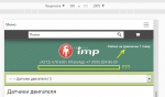
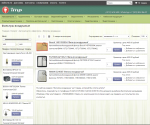
На счет отображения в поисковом запросе, лучше доделать каталог и его продублировать уже в поиск, так как режимы и отображение, как понимаю, у них должны быть идентичными.
 1
1

 Vaccina (11 Май 2016 - 05:04) писал:

