Шаблон осень очень нравится но его отображение во многих баузерах просто отвратительно!
в каждом из баузеров он выглядит как поломанный кубик-рубика.
у меня два вопроса решение одного из них сразу аннулирует другой
1 как установить единый размер (например как в сиянии) для отображения на всех баузерах
2 как привести в порядок отображение изменив все параметры для корректного отображения
 0
0

Осень Кросбаузерность
Автор мистка, 07 февр. 2014 08:06
Сообщений в теме: 16
#1
мистка
-
- Пользователи
-

- 2 435 сообщений
Активный участник
- ГородМосква
Отправлено 07 Февраль 2014 - 08:06
#2
мистка
-
- Пользователи
-
- 2 435 сообщений
Активный участник
- ГородМосква
Отправлено 07 Февраль 2014 - 09:16
хром
опера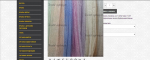
в айпаде
айпад
опера
в айпаде
айпад
Прикрепленные изображения
#3
мистка
-
- Пользователи
-
- 2 435 сообщений
Активный участник
- ГородМосква
Отправлено 07 Февраль 2014 - 11:09
возможно некоректные размеры шапки и лого так влияют, тогда подскажите оптимальные размеры
#4
ne_yana
-
- Модератоpы
-

- 1 190 сообщений
Активный участник
Отправлено 07 Февраль 2014 - 13:08
 злая я))) (07 Февраль 2014 - 11:09) писал:
возможно некоректные размеры шапки и лого так влияют, тогда подскажите оптимальные размеры
1. В файле style.css удалить
@media only screen and (max-width:1210px)
{
  .container{width:950px}
  .column,.columns{margin:0 10px}
  .half{width:455px}
  .one-third{width:220px}
  .two-third{width:690px}
  .hide-tablet-n-mobile{display:none!important}
  #category_view_type.list_view #product_list li{width:690px}
  #left-column{width: 324px;}
  #left-column #image-block{width:408px}
  #left-column #image-block #small_pic{width:408px;height:auto}
  #left-column #view_scroll_left,#left-column #view_scroll_right{width:48px}
  #left-column #thumbs_list{width: 210px;}
  #right-wrapper{width: 326px;}
  #product_page_hook_right{display:none}
  #product_comparison .product_desc{height:60px}
  ul#order_step li{width:168px}
  ul#order_step li#step_end{width:172px}
}
@media only screen and (max-width:959px)
{
  .container{width:710px;position: relative;}
  .column,.columns{margin:0 10px}
  .half{width:364px}
  .one-third{width:220px}
  .two-third{width:450px}
  .hide-desktop{display:inline!important}
  .hide-mobile{display:none!important}
  #header-right {height: 100%;margin: 0;}
  #megamenu{display:none!important}
  #header_shopping_cart{margin-top:21px;}
  #search_block_top{position: relative;float: right;margin: 16px 0px 0 0;clear: both;}
  #category_view_type.list_view #product_list li{width:450px}
  #left-column{width:100%}
  #left-column #image-block{width:528px;margin:0 auto}
  #left-column #image-block #small_pic{width:528px;height:auto}
  #left-column #view_scroll_left,#left-column #view_scroll_right{width:69px}
  #left-column #thumbs_list{width: 290px;}
  #right-wrapper{width:100%;margin:30px 0 0 0}
  table.autumn-table tr td:first-child {border: none;}
  table.autumn-table tr td:last-child {border: none;}
  ul.idTabs li{margin:0 0 -1px 0;display:block}
  table.responsive,table.responsive thead,table.responsive tbody,table.responsive tfoot,table.responsive th,table.responsive tr,table.responsive td,table.std,table.std thead,table.std tbody,table.std tfoot,table.std th,table.std tr,table.std td{display:block}
  .table_mobile_label{display:block}
  table.responsive thead,table.std thead{display:none}
  table.responsive tbody tr,table.std tbody tr{border-bottom:1px solid #e9e9e9}
  table.responsive tr.odd,table.std tr.odd{background:#fafafa!important}
  table.responsive td ,table.std td{border:none!important;position:relative;padding-left:50%}
  table.responsive tfoot tr,table.std tfoot tr{padding:10px 0;border-bottom:1px solid #e9e9e9}
  table.responsive tr td,table.std tr td{padding:5px!important;text-align: center !important;}
  .cart-table .cart_quantity .cart_quantity_input {float: none;}
  #order-opc h2 {font-size:10px;margin-bottom: 0;}
  #order-opc h2 span{font-size: 10px;display: inline-block;color: #fff;background: #333;padding: 10px 11px;margin-right: 5px;border-radius: 30px;-moz-border-radius: 30px;-webkit-border-radius: 30px;line-height: 10px;}
  #step{margin:15px 0;padding-top:20px;padding-bottom: 20px;border-top:1px dashed #c0c0c0;border-bottom:1px dashed #c0c0c0}
  #footer .block h4,#footer .block h4 a,#footer h4,#footer h4 a{font-size:16px;margin-bottom:20px}
  #footer .newsletter_input{width:70%}
  .sort_by{display: none;}
  #category_view_changer {float: left;}
  .sortPagiBar{padding-bottom:20px;height: 53px;}
  .sortPagiBar .nbrItemPage {display: none;}
  .accordion_main {display: block;}
.accordion a, .accordion_main a {
color: #000;
}
}
@media only screen and (max-width:860px)
{
  .flex-direction-nav .flex-prev {opacity: 1; left: 0;}
  .flex-direction-nav .flex-next {opacity: 1; right: 0;}
  .accordion_main {display: block;}
}
@media only screen and (max-width:767px)
{
  .container{width:450px; height: 100%;}
  .column,.columns{float:none;clear:both;margin:0}
  .full ,.half ,.one-third ,.two-third{width:450px}
  select{height:auto!important}
  #header #cart_block{display:none!important}
  #header_shopping_cart{margin-top:16px;width: 100%;}
#header-right {
float: right;
height: 100px;
position: relative;
z-index: 20;
margin-right: 10px;
margin-top: 10px;
}
  #header-logo {width: 100%;}
  #search_block_top{position: relative;float: right;margin: 16px 0px 0 0;width: 100%;}
  #search_block_top #search_query_top {width: 100%;}
  #header_user_info {color: #000;text-align: center;}
  #header_user_info a {color: #000;}
  .content_sortpagibar_pagination{margin-bottom:80px}
  #left-column #image-block #small_pic{width:434px;height:auto}
  #left-column #image-block{width:434px;margin:0 auto}
  #left-column #view_scroll_left,#left-column #view_scroll_right{width:61px}
  #left-column #thumbs_list{width: 310px;}
  .accordion_main {display: block;}
  table.autumn-table tr td:first-child, table.autumn-table tr td:last-child {border:none!important}
  table.responsive,table.responsive thead,table.responsive tbody,table.responsive tfoot,table.responsive th,table.responsive tr,table.responsive td,table.std,table.std thead,table.std tbody,table.std tfoot,table.std th,table.std tr,table.std td{display:block}
  table.responsive thead,table.std thead{display:none}
  table.responsive tbody tr,table.std tbody tr{border-bottom:1px solid #e9e9e9}
  table.responsive tr.odd,table.std tr.odd{background:#fafafa!important}
  table.responsive td ,table.std td{border:none!important;position:relative;padding-left:50%}
  table.responsive tfoot tr,table.std tfoot tr{padding:10px 0;border-bottom:1px solid #e9e9e9}
  ul.address{float:none;margin:0 0 20px 0!important;min-width:100%}
  #create-account_form {margin:0;width:300px;float:none}
  #footer > div{width:50%!important;margin:30px 0 0 0!important}
  #footer > div:nth-of-type(3){clear:left}
  #footer-bottom{text-align:center}
  .block2 {width: 450px;margin-top: 20px;}
  .block2 .block-content {width: 412px;}
}
@media only screen and (max-width:479px)
{
  body{min-width:300px}
  .container{width:300px}
  .column,.columns{float:none;clear:both;margin:0}
  .full ,.half ,.one-third ,.two-third{width:300px}
  #header-right{width:100%}
  #header_user_info .wishlist{display:none}
  #header-logo{width:100%}
  #header-logo a{text-align:center}
  #search_block_top{float:left}
  #header #cart_block{display:none!important}
  form.product_compare_form{clear:both}
  .sortPagiBar .nbrItemPage{clear:both;float:left;margin-top:20px}
  .sortPagiBar #productsSortForm{clear:both;float:left;margin-top:1px}
  #category_view_type.grid_view #product_list li{width:300px}
  #category_view_type.grid_view #product_list li.last_item{margin-bottom:10px!important}
  #category_view_type.grid_view #product_list .product_image{max-width:284px}
  #category_view_type.list_view #product_list .product_image_wrapper{margin-right:0}
  #category_view_type.list_view #product_list .product_image{max-width:284px}
  #category_view_type.grid_view #product_list .product_list_hover{width:284px;height:284px}
  #category_view_type.grid_view #product_list li .product_list_view_details_link{padding-top:260px}
  #category_view_type.grid_view .rect_img #product_list .product_list_hover{width:284px;height:426px}
  #category_view_type.grid_view .rect_img #product_list .product_list_add_to_cart{margin-top:165px}
  #category_view_type.grid_view .rect_img #product_list li .product_list_view_details_link{padding-top:402px}
  #category_view_type.list_view #product_list li{width:300px}
  #category_view_type.list_view #product_list .product_list_details{clear:both}
  #left-column #image-block #small_pic{width:284px;height:auto}
  #left-column #image-block{width:284px;margin:0 auto}
  #left-column #thumbs_list{width: 200px;}
  #left-column #view_scroll_left,#left-column #view_scroll_right{width:42px}
  #order-opc {display: none;}
  .content-form {width: 260px;}
  #footer-fluid > .container{margin-top:20px}
  #footer > div{width:100%!important;padding:0!important;margin:20px 0!important}
  #footer .block h4,#footer .block h4 a,#footer h4,#footer h4 a{margin-bottom:10px;cursor:pointer;text-decoration:none}
  #footer .block .open-close-footer{display:block}
  #footer .block_content{display:none;margin-top:20px}
  #footer .block_content.unfold{display:block}
  #footer-center{padding-bottom:1px}
  #footer .newsletter_input{width:85%}
  .autumnshowcase_block li{width:300px}
  .autumnshowcase_block .product_image{max-width:282px}
  .autumnshowcase_carousel{height:440px}
  #more_info_sheets input[type=text] {width: 110px;}
  .block2 {width: 300px;margin-top: 20px;}
  .block2 .block-content {width: 262px;}
}
2. Замените
#wrapper {
width: 100%;
}
на
#wrapper {
width: 1350px;
margin: 0 auto;
}
#footer-fluid {
background: #fff;
}
на
#footer-fluid {
background: #fff;
width: 1350px;
margin: 0 auto;
}
body {
line-height: 1;
font: 600 12px/18px 'Open Sans',Helvetica,Arial;
background: transparent;
overflow-x: hidden;
}
на
body {
line-height: 1;
font: 600 12px/18px 'Open Sans',Helvetica,Arial;
background: transparent;
}
#5
мистка
-
- Пользователи
-
- 2 435 сообщений
Активный участник
- ГородМосква
Отправлено 07 Февраль 2014 - 13:20
body {
line-height: 1;
font: 600 12px/18px 'Open Sans',Helvetica,Arial;
background: transparent;
overflow-x: hidden;
}
ни где нет
line-height: 1;
font: 600 12px/18px 'Open Sans',Helvetica,Arial;
background: transparent;
overflow-x: hidden;
}
ни где нет
#6
мистка
-
- Пользователи
-
- 2 435 сообщений
Активный участник
- ГородМосква
Отправлено 07 Февраль 2014 - 13:33
может с отсутствием этой строчки и связано не корректное отображение? тогда куда ее вставить чтоб сайт корректно адаптировался
#7
ne_yana
-
- Модератоpы
-
- 1 190 сообщений
Активный участник
Отправлено 07 Февраль 2014 - 13:37
злая я))) (07 Февраль 2014 - 13:33) писал:
может с отсутствием этой строчки и связано не корректное отображение? тогда куда ее вставить чтоб сайт корректно адаптировался
#8
мистка
-
- Пользователи
-
- 2 435 сообщений
Активный участник
- ГородМосква
Отправлено 07 Февраль 2014 - 13:42
большое спасибо! а подскажите еще по этому вопросу я чувствую истина где то рядом
и еще подскажите где можно онлайн глянуть как отображается сайт прыгать по компам уже нет возможноси
ЖАЛКО ЧТО ПРИХОДИТСЯ УБИРАТЬ АДАПТИВНОСТЬ , КАК ВЫ ДУМАЕТЕ ЕГО ТОЧНО НЕЛЬЗЯ ПОДОГНАТЬ ИЗМЕНИВ РАЗМЕРЫ
и еще подскажите где можно онлайн глянуть как отображается сайт прыгать по компам уже нет возможноси
ЖАЛКО ЧТО ПРИХОДИТСЯ УБИРАТЬ АДАПТИВНОСТЬ , КАК ВЫ ДУМАЕТЕ ЕГО ТОЧНО НЕЛЬЗЯ ПОДОГНАТЬ ИЗМЕНИВ РАЗМЕРЫ
#9
ne_yana
-
- Модератоpы
-
- 1 190 сообщений
Активный участник
Отправлено 07 Февраль 2014 - 17:48
злая я))) (07 Февраль 2014 - 13:42) писал:
большое спасибо! а подскажите еще по этому вопросу я чувствую истина где то рядом
и еще подскажите где можно онлайн глянуть как отображается сайт прыгать по компам уже нет возможноси
ЖАЛКО ЧТО ПРИХОДИТСЯ УБИРАТЬ АДАПТИВНОСТЬ , КАК ВЫ ДУМАЕТЕ ЕГО ТОЧНО НЕЛЬЗЯ ПОДОГНАТЬ ИЗМЕНИВ РАЗМЕРЫ
и еще подскажите где можно онлайн глянуть как отображается сайт прыгать по компам уже нет возможноси
ЖАЛКО ЧТО ПРИХОДИТСЯ УБИРАТЬ АДАПТИВНОСТЬ , КАК ВЫ ДУМАЕТЕ ЕГО ТОЧНО НЕЛЬЗЯ ПОДОГНАТЬ ИЗМЕНИВ РАЗМЕРЫ
В первую очередь нужно изменить логотип, лучше всего сделать его с прозрачным фоном и без нижней панельки с телефоном, т.к. при сжатии экрана получается некрасивый эффект.
#10
мистка
-
- Пользователи
-
- 2 435 сообщений
Активный участник
- ГородМосква
Отправлено 07 Февраль 2014 - 19:39
ne_yana (07 Февраль 2014 - 17:48) писал:
Здравствуйте, адаптивность шаблона была нарушена из-за изменений, который производились на сайте, прежде всего это касается шапки.
В первую очередь нужно изменить логотип, лучше всего сделать его с прозрачным фоном и без нижней панельки с телефоном, т.к. при сжатии экрана получается некрасивый эффект.
В первую очередь нужно изменить логотип, лучше всего сделать его с прозрачным фоном и без нижней панельки с телефоном, т.к. при сжатии экрана получается некрасивый эффект.
Пожалуйса укажите исходные размеры шапки и лого от которых я могу исходить и очень важны ссылки в шапке , их же можно задать картинками главное угадать с размером чтоб встали правильно при адаптивности
#11
@lina_va
-

- Модератоpы
-
- 498 сообщений
Активный участник
Отправлено 08 Февраль 2014 - 16:27
злая я))) (07 Февраль 2014 - 19:39) писал:
Пожалуйса укажите исходные размеры шапки и лого от которых я могу исходить и очень важны ссылки в шапке , их же можно задать картинками главное угадать с размером чтоб встали правильно при адаптивности
Размер шапки: 1200x144
#12
мистка
-
- Пользователи
-
- 2 435 сообщений
Активный участник
- ГородМосква
Отправлено 08 Февраль 2014 - 16:41
Спасибо! попробуем переделать и вернуть адаптивность, есть 1 нюанс у нас в шапке стоит 4 ссылки как лучше быть с ними?
#13
@lina_va
-
- Модератоpы
-
- 498 сообщений
Активный участник
Отправлено 08 Февраль 2014 - 16:48
злая я))) (08 Февраль 2014 - 16:41) писал:
Спасибо! попробуем переделать и вернуть адаптивность, есть 1 нюанс у нас в шапке стоит 4 ссылки как лучше быть с ними?
#14
мистка
-
- Пользователи
-
- 2 435 сообщений
Активный участник
- ГородМосква
Отправлено 08 Февраль 2014 - 16:56
вот посмотрите пожалуйста на сайте 4 ячейки - это просто картинка шапки и к ней приделанны ссылки
Скрытый текст
#15
Alexey11
-

- Модератоpы
-
- 1 057 сообщений
Активный участник
- ГородНижний новгород
Отправлено 09 Февраль 2014 - 09:48
злая я))) (08 Февраль 2014 - 16:56) писал:
вот посмотрите пожалуйста на сайте 4 ячейки - это просто картинка шапки и к ней приделанны ссылки
Скрытый текст
#16
мистка
-
- Пользователи
-
- 2 435 сообщений
Активный участник
- ГородМосква
Отправлено 09 Февраль 2014 - 13:29
Alexey11 (09 Февраль 2014 - 09:48) писал:
Если у вас бэкграунд шапки выводится таким образом. То адаптивными данные ссылки сделать не получится.
#17
Vaccina
-

- Модераторы
-
- 24 353 сообщений
Активный участник
Отправлено 13 Февраль 2014 - 06:12
лучше телефоны и баннеры со ссылками сделать блоками, например:
<div class="ssilki">
  <a class="time" href="ссылка"></a>
  <a class="price" href="ссылка"></a>
  <a class="dostavka" href="ссылка"></a>
  и т.д.
</div>
и в main.css данным добавленным классам прописывать свой фон, например:
.time{
background:url(ссылка на картинку\фон) no-repeat left top;
}


Количество пользователей, читающих эту тему: 0
0 пользователей, 0 гостей, 0 анонимных


