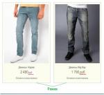
2. Сделать шрифт в меню полужирным.
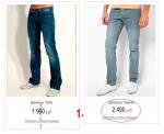
3. Сделать тонкую серую рамку в 1px по внешнему контуру уже имеющейся рис. №2
4. Слово "руб" сделать меньше, а цифры оставить прежней величины.
 0
0

Продвинутый пользователь

Отправлено 04 Апрель 2014 - 21:03
Активный участник

Отправлено 05 Апрель 2014 - 03:39
.nav {
	background: #627A9C;
	list-style: none outside none;
	position: relative;
	z-index: 30;
}
измените значение background
.nav a {
	color: #FFFFFF;
	padding: 8px 18px;
	text-transform: uppercase;
	z-index: 50;
}
замените на:
.nav a {
	color: #FFFFFF;
	font-weight: bold;
	padding: 8px 18px;
	text-transform: uppercase;
	z-index: 50;
}
3.найдите:
.containers .items, .containers2 .items {
	display: inline-block;
	float: none !important;
	vertical-align: top;
	width: 280px !important;
}
замените на:
.containers .items, .containers2 .items {
	border: 1px solid #CCCCCC;
	display: inline-block;
	float: none !important;
	vertical-align: top;
	width: 280px !important;
}
4.найдите:
.price a span {
	color: #AD1D9F;
	font: 25px Arial Narrow;
}
замените на:
.price a span span:nth-child(1) {
	color: #AD1D9F;
	font: 25px Arial Narrow;
}
.price a span span {
	font: 20px Arial Narrow;
	color: #AD1D9F;
}
Продвинутый пользователь
Отправлено 06 Апрель 2014 - 20:46
 Vaccina (05 Апрель 2014 - 03:39) писал:
.nav {
background: #627A9C;
list-style: none outside none;
position: relative;
z-index: 30;
}
измените значение background
.nav a {
color: #FFFFFF;
padding: 8px 18px;
text-transform: uppercase;
z-index: 50;
}
замените на:
.nav a {
color: #FFFFFF;
font-weight: bold;
padding: 8px 18px;
text-transform: uppercase;
z-index: 50;
}
3.найдите:
.containers .items, .containers2 .items {
display: inline-block;
float: none !important;
vertical-align: top;
width: 280px !important;
}
замените на:
.containers .items, .containers2 .items {
border: 1px solid #CCCCCC;
display: inline-block;
float: none !important;
vertical-align: top;
width: 280px !important;
}
4.найдите:
.price a span {
color: #AD1D9F;
font: 25px Arial Narrow;
}
замените на:
.price a span span:nth-child(1) {
color: #AD1D9F;
font: 25px Arial Narrow;
}
.price a span span {
font: 20px Arial Narrow;
color: #AD1D9F;
}
Активный участник

Отправлено 06 Апрель 2014 - 21:27
.head {width: 100%;font-size:16px;position: relative;font-family: Arial Narrow;}
заменить на
.head {width: 100%;font-size:16px;position: relative;font-family: Arial Narrow;background: linear-gradient(to top, #9C9C9C, #FFFFFF);}
Можете изменять начальный(нижний) цвет #9C9C9C, и верхний соответственно #FFFFFF.
Продвинутый пользователь
Отправлено 11 Апрель 2014 - 10:38
daria_dnk (06 Апрель 2014 - 21:27) писал:
.head {width: 100%;font-size:16px;position: relative;font-family: Arial Narrow;}
заменить на
.head {width: 100%;font-size:16px;position: relative;font-family: Arial Narrow;background: linear-gradient(to top, #9C9C9C, #FFFFFF);}
Можете изменять начальный(нижний) цвет #9C9C9C, и верхний соответственно #FFFFFF.Продвинутый пользователь
Отправлено 11 Апрель 2014 - 10:47
Активный участник

Отправлено 11 Апрель 2014 - 11:01
yvn (11 Апрель 2014 - 10:38) писал:
<a href="http://*.ru/cart">замените
<a href="http://*.ru/cart" style="
background: linear-gradient(to top, #ffffff, #7c8b8d);
">
найдите
<input class="search" name="q" type="search" value="{% IF SEARCH_QUERY %}{SEARCH_QUERY}{% ELSE %}Поиск по магазину...{% ENDIF %}" onfocus="if(this.value=='Поиск по магазину...'){this.value='';}" onblur="if(this.value==''){this.value='Поиск по магазину...';}" />
замените
<input class="search" name="q" type="search" value="{% IF SEARCH_QUERY %}{SEARCH_QUERY}{% ELSE %}Поиск по магазину...{% ENDIF %}" onfocus="if(this.value=='Поиск по магазину...'){this.value='';}" onblur="if(this.value==''){this.value='Поиск по магазину...';}"style="
background: linear-gradient(to top, #ffffff, #dbd8d8);
" />
Продвинутый пользователь
Отправлено 11 Апрель 2014 - 13:22
Ирина345 (11 Апрель 2014 - 11:01) писал:
<a href="http://cityton.ru/cart">замените
<a href="http://cityton.ru/cart" style="
background: linear-gradient(to top, #ffffff, #7c8b8d);
">
найдите
<input class="search" name="q" type="search" value="{% IF SEARCH_QUERY %}{SEARCH_QUERY}{% ELSE %}Поиск по магазину...{% ENDIF %}" onfocus="if(this.value=='Поиск по магазину...'){this.value='';}" onblur="if(this.value==''){this.value='Поиск по магазину...';}" />
замените
<input class="search" name="q" type="search" value="{% IF SEARCH_QUERY %}{SEARCH_QUERY}{% ELSE %}Поиск по магазину...{% ENDIF %}" onfocus="if(this.value=='Поиск по магазину...'){this.value='';}" onblur="if(this.value==''){this.value='Поиск по магазину...';}"style="
background: linear-gradient(to top, #ffffff, #dbd8d8);
" />
Активный участник
Отправлено 11 Апрель 2014 - 13:30
yvn (11 Апрель 2014 - 13:22) писал:
<a href="{CART_URL}"><strong>{% IF cart_count_empty %}
					 <span>0</span>
замените
<a href="{CART_URL}"style="
background: linear-gradient(to top, #ffffff, #7c8b8d);
"><strong>{% IF cart_count_empty %}
					 <span>0</span>
Активный участник

Отправлено 11 Апрель 2014 - 13:34
yvn (11 Апрель 2014 - 13:22) писал:
@media screen and (min-width: 860px) {
.buy-item button {width: auto;overflow: visible;padding: 0.714em 1em 0.714em 2.5em;background: url("{ASSETS_IMAGES_PATH}icons.png") no-repeat scroll 10% -552px #13AF13;color: #fff;font-size: 100%;margin: 0 1em 0 0;border: none;font-weight: normal;margin: auto;color: #fff;letter-spacing: 1px;text-transform: uppercase;line-height: 1;text-shadow: 0px 1px 0px rgba(0,0,0,0.2);display: inline-block;text-align: center;}
}
@media screen  and (max-width: 480px) {
.buy-item button {width: auto;overflow: visible;padding: 0.714em 1em 0.714em 2.5em;background: url("{ASSETS_IMAGES_PATH}icons.png") no-repeat scroll 10% -552px #13AF13;color: #fff;font-size: 100%;margin: 0 1em 0 0;border: none;font-weight: normal;margin: auto;color: #fff;letter-spacing: 1px;text-transform: uppercase;line-height: 1;text-shadow: 0px 1px 0px rgba(0,0,0,0.2);display: inline-block;text-align: center;}
}
/* 1020px и больше*/
@media screen and (min-width: 1200px) {
}
@media screen and (max-width: 860px) {
a.more-items, a.power.middle, .card-action p.current {width: 50%;}
}
@media only screen and (min-width: 768px) and (max-width: 1024px)  {
section.newsletter h3 {font-size: 1em; margin-top: 3px;}
section.newsletter form input[type="email"] {width: 14em;}
}
@media only screen and (max-width: 768px) {
body {background: #fff;}
header[role="banner"] .hgroup {position: relative; width: 100%; top: 0; left: 0; margin: 1.5em 0 1em 0; overflow: hidden;}
header[role="banner"] form {position: relative; top: 0; left: 0; clear: both;}
header[role="banner"] {margin-bottom: 2em; overflow: visible;}
section.global {height: auto;}
section.global ul {float: none; margin-bottom: 0.5em;}
section.global ul.user-info {position: relative; left: 0;}
a.more-items, a.power.middle, .card-action p.current {width: 50%;} ul.item-list .item-meta {margin: 0;}
.home section[role="main"] {clear: both;}
.facet-header a {clear: left; display: block; margin: 0.167em 0; padding-left: 0; float: none;}
.sort-list p {float: left; margin: 0;}
.amount {clear: both;float: none !important;}
.x-list {float: left;}
.item aside article header {padding: 1.5em;}
.basket td.item-image, .basket td.item-description {float: none;}
.message, .message.warning, message.holiday {background-image: none; padding-left: 3em;}
footer .networks .newsletter, footer .networks .newsletter form {display: block; float: none; margin-bottom: 1em;}
.networks li:nth-child(2) {margin-left: 0;}
section.newsletter {width: auto; text-align: left; padding: 1em; left: auto; height: auto; overflow: hidden;}
section.newsletter div {text-align: left; width: 100%; overflow: hidden;}
section.newsletter h3 {float: none; margin-bottom: 1em;}
section.newsletter:before, section.newsletter:after, .chevron:before, .chevron:after {display: none;}
.home .activity .chevron ul.gallery-strip {margin: 0;}
section.total div.actions p {float: none;position: absolute;width: 60%;left: 0;top: -0.5em;}
header p.short-note {text-align: left; margin: 0;}
.card-center {width: 44%;}
.item aside .share li, section.total .advice div {float: none; margin: 0 0 0.5em 0; width: auto;}
}
@media only screen and (max-width: 480px) {
body {background: #fff;}
section.global {height: auto; overflow: hidden}
section.global ul {float: none; margin-bottom: 0.5em;}
header[role="banner"] .hgroup {position: relative; width: 100%; top: 0; left: 0; margin: 1.5em 0 1em 0; overflow: hidden;}
header[role="banner"] .hgroup h2 {font-size: 1.25em; margin-top: 1.5em;}
header[role="banner"] form {position: relative; top: 0; left: 0; clear: both;}
.ie8 header[role="banner"] form {margin-bottom: 2em;}
header[role="banner"] {margin-bottom: 2em; overflow: visible;}
.sections h1 {margin-left: 0px; width: 99.5%;}
input[type="submit"] {-webkit-appearance:none; -webkit-border-radius:0px;}
input[type="search"] {-moz-appearance:none; -webkit-appearance:none; -webkit-border-radius:0px;}
form[role="search"] div {width: 100%;}
.home section header a {display: block; margin: 0;}
footer section {width: 50%;}
body.two-column section[role="main"], section.sign-in, section.new-customer {clear: both; float: none; width: 100%;}
footer section {width: 45%; margin: 0 5% 1em 0;}
footer section:nth-child(2n) {margin-right: 0;}
footer section:nth-child(5) {clear: both; width: 100%; border-top: 1px solid #7c8b8d; padding-top: 2em; margin-top: 1em;}
footer ul.networks {text-align: left;}
footer ul.networks li:nth-child(3) {margin-left: 0;}
footer ul.networks li {float: left; margin-bottom: 0.5em;}
body.two-column.item section[role="main"] {float: none; width: 100%; margin-bottom: 1em}
.item aside, .selling-intro div {float: none; width: 100%; margin: 0;}
.item aside article header {padding: 0;}
.item aside article header {padding: 1.5em;}
.item aside article header h4 + a {width: 22.2222%; float: right; position: relative; margin: 0 2% 0 0; top: -1.5em;}
.item aside .share li {float: left; margin: 0 1em 0 0; word-break: 80px;}
table td div.item-image {float: left; margin: 0;}
}
@media only screen and (max-width: 700px) {
body.two-column section[role="main"], section.sign-in, section.new-customer {clear: both; float: none; width: 100%;}
body.two-column.item section[role="main"] {float: none; width: 100%; margin-bottom: 1em}
.item aside, .selling-intro div {float: none; width: 100%; margin: 0;}
.item aside article header {padding: 0;}
.item aside article header {padding: 1.5em;}
.item aside article header h4 + a {width: 22.2222%; float: right; position: relative; margin: 0 2% 0 0; top: -1.5em;}
.item aside .share li {float: left; margin: 0 1em 0 0; word-break: 80px;}
}
Продвинутый пользователь
Отправлено 11 Апрель 2014 - 16:11
Ирина345 (11 Апрель 2014 - 13:30) писал:
<a href="{CART_URL}"><strong>{% IF cart_count_empty %}
					 <span>0</span>
замените
<a href="{CART_URL}"style="
background: linear-gradient(to top, #ffffff, #7c8b8d);
"><strong>{% IF cart_count_empty %}
					 <span>0</span>
Продвинутый пользователь
Отправлено 11 Апрель 2014 - 16:25
MikDark (11 Апрель 2014 - 13:34) писал:
@media screen and (min-width: 860px) {
.buy-item button {width: auto;overflow: visible;padding: 0.714em 1em 0.714em 2.5em;background: url("{ASSETS_IMAGES_PATH}icons.png") no-repeat scroll 10% -552px #13AF13;color: #fff;font-size: 100%;margin: 0 1em 0 0;border: none;font-weight: normal;margin: auto;color: #fff;letter-spacing: 1px;text-transform: uppercase;line-height: 1;text-shadow: 0px 1px 0px rgba(0,0,0,0.2);display: inline-block;text-align: center;}
}
@media screen and (max-width: 480px) {
.buy-item button {width: auto;overflow: visible;padding: 0.714em 1em 0.714em 2.5em;background: url("{ASSETS_IMAGES_PATH}icons.png") no-repeat scroll 10% -552px #13AF13;color: #fff;font-size: 100%;margin: 0 1em 0 0;border: none;font-weight: normal;margin: auto;color: #fff;letter-spacing: 1px;text-transform: uppercase;line-height: 1;text-shadow: 0px 1px 0px rgba(0,0,0,0.2);display: inline-block;text-align: center;}
}
/* 1020px и больше*/
@media screen and (min-width: 1200px) {
}
@media screen and (max-width: 860px) {
a.more-items, a.power.middle, .card-action p.current {width: 50%;}
}
@media only screen and (min-width: 768px) and (max-width: 1024px) {
section.newsletter h3 {font-size: 1em; margin-top: 3px;}
section.newsletter form input[type="email"] {width: 14em;}
}
@media only screen and (max-width: 768px) {
body {background: #fff;}
header[role="banner"] .hgroup {position: relative; width: 100%; top: 0; left: 0; margin: 1.5em 0 1em 0; overflow: hidden;}
header[role="banner"] form {position: relative; top: 0; left: 0; clear: both;}
header[role="banner"] {margin-bottom: 2em; overflow: visible;}
section.global {height: auto;}
section.global ul {float: none; margin-bottom: 0.5em;}
section.global ul.user-info {position: relative; left: 0;}
a.more-items, a.power.middle, .card-action p.current {width: 50%;} ul.item-list .item-meta {margin: 0;}
.home section[role="main"] {clear: both;}
.facet-header a {clear: left; display: block; margin: 0.167em 0; padding-left: 0; float: none;}
.sort-list p {float: left; margin: 0;}
.amount {clear: both;float: none !important;}
.x-list {float: left;}
.item aside article header {padding: 1.5em;}
.basket td.item-image, .basket td.item-description {float: none;}
.message, .message.warning, message.holiday {background-image: none; padding-left: 3em;}
footer .networks .newsletter, footer .networks .newsletter form {display: block; float: none; margin-bottom: 1em;}
.networks li:nth-child(2) {margin-left: 0;}
section.newsletter {width: auto; text-align: left; padding: 1em; left: auto; height: auto; overflow: hidden;}
section.newsletter div {text-align: left; width: 100%; overflow: hidden;}
section.newsletter h3 {float: none; margin-bottom: 1em;}
section.newsletter:before, section.newsletter:after, .chevron:before, .chevron:after {display: none;}
.home .activity .chevron ul.gallery-strip {margin: 0;}
section.total div.actions p {float: none;position: absolute;width: 60%;left: 0;top: -0.5em;}
header p.short-note {text-align: left; margin: 0;}
.card-center {width: 44%;}
.item aside .share li, section.total .advice div {float: none; margin: 0 0 0.5em 0; width: auto;}
}
@media only screen and (max-width: 480px) {
body {background: #fff;}
section.global {height: auto; overflow: hidden}
section.global ul {float: none; margin-bottom: 0.5em;}
header[role="banner"] .hgroup {position: relative; width: 100%; top: 0; left: 0; margin: 1.5em 0 1em 0; overflow: hidden;}
header[role="banner"] .hgroup h2 {font-size: 1.25em; margin-top: 1.5em;}
header[role="banner"] form {position: relative; top: 0; left: 0; clear: both;}
.ie8 header[role="banner"] form {margin-bottom: 2em;}
header[role="banner"] {margin-bottom: 2em; overflow: visible;}
.sections h1 {margin-left: 0px; width: 99.5%;}
input[type="submit"] {-webkit-appearance:none; -webkit-border-radius:0px;}
input[type="search"] {-moz-appearance:none; -webkit-appearance:none; -webkit-border-radius:0px;}
form[role="search"] div {width: 100%;}
.home section header a {display: block; margin: 0;}
footer section {width: 50%;}
body.two-column section[role="main"], section.sign-in, section.new-customer {clear: both; float: none; width: 100%;}
footer section {width: 45%; margin: 0 5% 1em 0;}
footer section:nth-child(2n) {margin-right: 0;}
footer section:nth-child(5) {clear: both; width: 100%; border-top: 1px solid #7c8b8d; padding-top: 2em; margin-top: 1em;}
footer ul.networks {text-align: left;}
footer ul.networks li:nth-child(3) {margin-left: 0;}
footer ul.networks li {float: left; margin-bottom: 0.5em;}
body.two-column.item section[role="main"] {float: none; width: 100%; margin-bottom: 1em}
.item aside, .selling-intro div {float: none; width: 100%; margin: 0;}
.item aside article header {padding: 0;}
.item aside article header {padding: 1.5em;}
.item aside article header h4 + a {width: 22.2222%; float: right; position: relative; margin: 0 2% 0 0; top: -1.5em;}
.item aside .share li {float: left; margin: 0 1em 0 0; word-break: 80px;}
table td div.item-image {float: left; margin: 0;}
}
@media only screen and (max-width: 700px) {
body.two-column section[role="main"], section.sign-in, section.new-customer {clear: both; float: none; width: 100%;}
body.two-column.item section[role="main"] {float: none; width: 100%; margin-bottom: 1em}
.item aside, .selling-intro div {float: none; width: 100%; margin: 0;}
.item aside article header {padding: 0;}
.item aside article header {padding: 1.5em;}
.item aside article header h4 + a {width: 22.2222%; float: right; position: relative; margin: 0 2% 0 0; top: -1.5em;}
.item aside .share li {float: left; margin: 0 1em 0 0; word-break: 80px;}
}
Продвинутый пользователь
Отправлено 14 Апрель 2014 - 19:53
Продвинутый пользователь
Отправлено 14 Апрель 2014 - 21:58
Активный участник
Отправлено 14 Апрель 2014 - 22:31
yvn (14 Апрель 2014 - 21:58) писал:
.nav li li a {display:block;background: #c8e0f7;top: 0px;color:#000;width: 130px;}
и замените на
.nav li li a {border-top: 10;display:block;background: #c8e0f7;margin-bottom: -4px;color:#000;width: 130px; border-bottom-left-radius: 4px;border-bottom-right-radius: 4px; border-bottom-left-radius: 4px}
Продвинутый пользователь
Отправлено 15 Апрель 2014 - 11:50
daria_dnk (14 Апрель 2014 - 22:31) писал:
.nav li li a {display:block;background: #c8e0f7;top: 0px;color:#000;width: 130px;}
и замените на
.nav li li a {border-top: 10;display:block;background: #c8e0f7;margin-bottom: -4px;color:#000;width: 130px; border-bottom-left-radius: 4px;border-bottom-right-radius: 4px; border-bottom-left-radius: 4px}
Активный участник

Отправлено 15 Апрель 2014 - 12:19
.view-switch {float: right;}
замените его на
.view-switch {float: right;display: none;}
Продвинутый пользователь
Отправлено 15 Апрель 2014 - 13:24
empty9228 (15 Апрель 2014 - 12:19) писал:
.view-switch {float: right;}
замените его на
.view-switch {float: right;display: none;}
Активный участник
Отправлено 15 Апрель 2014 - 14:35
.rating {margin-bottom: 1em;margin-top: 1em;}
замените его на .rating {margin-bottom: 3px;margin-top: 4px;}
.price {font-size: 16px; color: #000; margin: 10px;}
замените его на .price {font-size: 16px; color: #000; margin: 10px;height: 22px;}
Продвинутый пользователь
Отправлено 17 Апрель 2014 - 21:37
empty9228 (15 Апрель 2014 - 14:35) писал:
.rating {margin-bottom: 1em;margin-top: 1em;}
замените его на.rating {margin-bottom: 3px;margin-top: 4px;}
.price {font-size: 16px; color: #000; margin: 10px;}
замените его на.price {font-size: 16px; color: #000; margin: 10px;height: 22px;}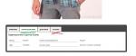


0 пользователей, 0 гостей, 0 анонимных

Система для сообществ IP.Board
Лицензия зарегистрирована на: StoreLand

